The three emails, the brand rules that keep them looking like your brand, and the prompts that produce the finished creatives.
By Anne Reyes · · 7 min read
Someone chose your product, put it in the cart, and left. That is not a lost customer. That is a customer who got interrupted.
The flow that goes after them is the highest earning email you will ever set up, and most stores either send one reminder or send nothing. Klaviyo's 2026 benchmarks put email flows at nearly 41% of all email revenue from 5.3% of sends. It is the smallest amount of work in your marketing with the largest number attached to it.
Three emails is the whole flow. Below is one built end to end, brand and all, with every prompt written so you can paste it and fill in your own.
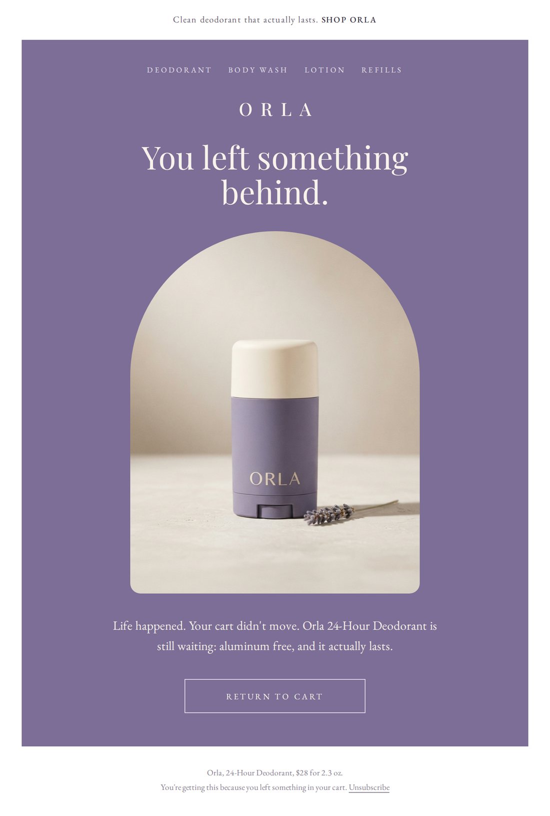
Email oneCopy, photography and button, produced in one session from the brand block below.
What is inside
The brand block that everything else inherits from. The brief for each of the three emails, so you can see the job each one is doing before you write a word. The four prompts, in plain English with brackets to fill in. And the one rule that stops your copy coming back misspelled inside the artwork.
What does a finished abandoned cart flow look like?
Three emails, each answering a different reason the person walked. Here are the other two. Same brand, same product, three different jobs.
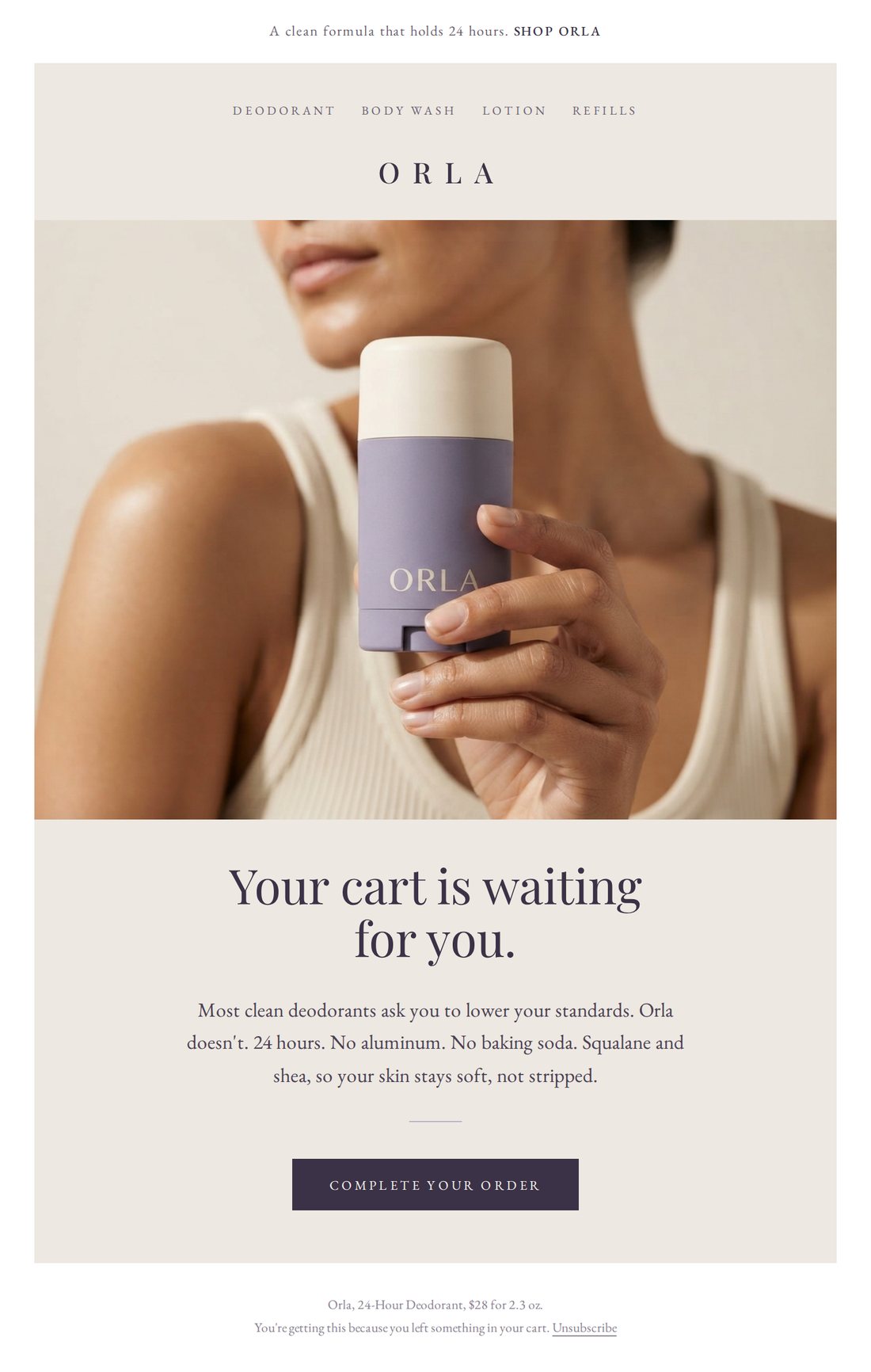
Email twoHandles price and doubt. The product is the focal point, not the model.
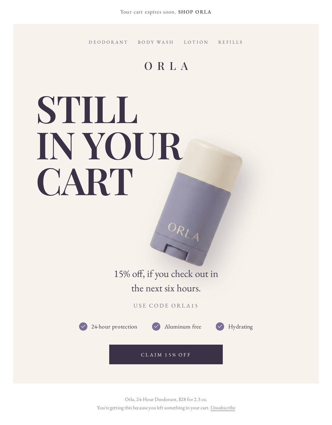
Email threeThe last call, and the only one that discounts.
The whole thing on one page
Step
What you do
How long
1
Paste your brand block so everything after it matches
5 min
2
Ask for the three emails, one per reason they left
5 min
3
Ask for the product photography
5 min
4
Ask for the finished designs, then request one change
10 min
What you need before you start
Your product name, your price, and the two or three things that actually make it worth buying.
The discount you are willing to give in the third email, and the code for it.
One photo of your product. If the product has not launched yet, skip this. Describing it works.
Why does the brand block come first?
Because everything after it inherits from it. Skip it and you get generic emails, then photography that does not match them, then a design that matches neither, and you spend the session correcting tone one message at a time.
This is the block I used. It is a made up brand, so you can see the whole standard in one place rather than guessing at what belongs in it.
Lavender
#7C6E96
Plum
#3B3247
Oat
#EDE8E1
Cream
#F7F3EC
Four colors is enough for an entire flow. One to lead, one for type, two to sit behind product photography.
The brand block, worked example
Here is my brand. Use it for everything I ask for after this message.
Brand: ORLA. Clean body care.
Product: Orla 24-Hour Deodorant, $28, 2.3 oz.
What it is: aluminum free, baking soda free, no synthetic fragrance, and it still holds 24 hours. Squalane and shea hydrate the underarm skin instead of stripping it.
The three claims that carry every email: 24 hour odor control. Free of aluminum, baking soda and synthetic fragrance. Hydrating.
Packaging: an oval stick, matte muted lavender body, warm cream cap, the wordmark ORLA in a light widely letter spaced serif.
Colors: lavender #7C6E96, plum #3B3247, warm oat #EDE8E1, cream #F7F3EC.
Type: a simple serif throughout. High contrast serif for the wordmark and headlines, a plain readable serif for body copy.
Look: mature, quiet, editorial. Closer to a skincare brand than a natural deodorant brand. No pastel, no wellness cliches, never a plain white background.
Voice: short sentences, plain English, no hype, no exclamation marks, no em dashes.
Paste once, at the top. Costs nothing. Every email, photograph and layout after it inherits from this block.
Now the same block with your brand in it. Fill in the brackets and delete nothing else, because the labels are what tell Claude which part is doing which job.
The brand block, yours to fill in
Here is my brand. Use it for everything I ask for after this message.
Brand: [brand name]. [what category you are in]
Product: [product name], [price], [size].
What it is: [the two or three sentences you would say to a customer who asked why it is worth the money]
The three claims that carry every email: [claim one]. [claim two]. [claim three].
Packaging: [shape, material, finish, the colors, where the logo sits]
Colors: [name and hex for each, two to four of them]
Type: [serif or sans, one line on the feeling of it]
Look: [three adjectives, then one sentence on what it should not look like]
Voice: [three rules, written as instructions]
Returns a confirmation, nothing else. About 1 minute. Save it in a note and reuse it for every campaign you build after this one.
How do you get all three emails written at once?
Name the reason each one is answering. That single instruction is the difference between a flow and three versions of the same reminder.
Prompt 1, the three emails
Write my abandoned cart flow. Three emails, in my brand voice.
Each one answers a different reason the person left the cart:
1. They got distracted. Assume the interruption. Remind them and nothing else. No discount.
2. Price and doubt. Argue the product using my three claims. Still no discount.
3. Last call. This is the only email that discounts. Offer [15%] with the code [CODE], and make the window [the next six hours].
For each email give me: a subject line, a preview line, one headline, a body of no more than three short sentences, and the words on the button.
Keep every email extremely short. A person reads this on a phone between two other things.
No em dashes. No exclamation marks. Do not use the same headline twice across the three.
Returns all three emails, written and ready to approve. About 2 minutes. Change the copy here, before any artwork exists.
What is the brief for each of the three emails?
Every email in the flow has one job and one failure mode. These are the three briefs I wrote before any copy existed. Read them first, then send them to Claude one at a time if you want the emails written individually rather than in a single pass.
Brief, email one
EMAIL ONE. The reminder.
Sends: 1 hour after the cart is abandoned.
Reason it answers: they got distracted. Something interrupted them. Nothing is wrong with the product or the price.
Job: remind, and get out of the way.
Tone: warm, unbothered, slightly amused. Not worried.
Must include: the product name, one claim, a button back to the cart.
Must not include: a discount, urgency, a countdown, or any argument for the product. Nothing has been objected to yet.
Length: one headline and no more than two short sentences.
Artwork: the product on its own, styled, no model. This is the email that has to look like the brand.
Failure mode: discounting here. It teaches your list that abandoning a cart is how you get money off, and you pay that margin forever on people who were always going to buy.
The highest performing email of the three, and the one most often over-written.
Brief, email two
EMAIL TWO. The objection.
Sends: 24 hours after the cart is abandoned.
Reason it answers: price and doubt. They are not sure it works, or not sure it is worth the money.
Job: name the doubt out loud, then answer it with the three claims.
Tone: confident, factual, no defensiveness and no hype.
Must include: the doubt stated plainly in the first line, then the claims as short separate statements rather than a paragraph.
Must not include: a discount. Answering doubt with money says the doubt was correct.
Length: one headline and no more than three short sentences.
Artwork: a person with the product, but the product is the focal point and fills the frame. A background color that does not compete with the packaging.
Failure mode: listing features instead of naming the doubt. The claims only land once the reader has seen you say the thing they were already thinking.
The only email in the flow that is allowed to argue.
Brief, email three
EMAIL THREE. The last call.
Sends: 48 hours after the cart is abandoned.
Reason it answers: they are not going to buy at full price, and this is the last message before the cart goes cold.
Job: make the offer, put a real window on it, and stop.
Tone: direct. One clear thing to do.
Must include: the discount, the code, and a specific window written in plain language.
Must not include: false scarcity, a fake countdown, or a repeat of the arguments from email two. They already read those.
Length: one headline and no more than two short sentences.
Artwork: the biggest type in the flow. Set the line in capitals and let the product overlap it.
Failure mode: an open ended discount. If the window is not real, the flow stops working the second time someone goes through it.
Send this one and stop. A fourth email costs you the unsubscribe, not the sale.
How do you get the product photography without a shoot?
Describe the product once and ask for the shots the emails need. If your product already exists, attach a photo of it in the same message and everything below runs the same way.
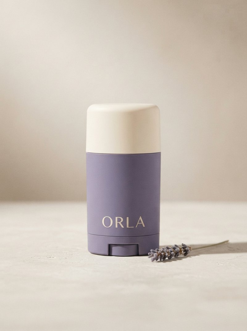
The hero shotGenerated first. Every other shot references it so the product stays identical.
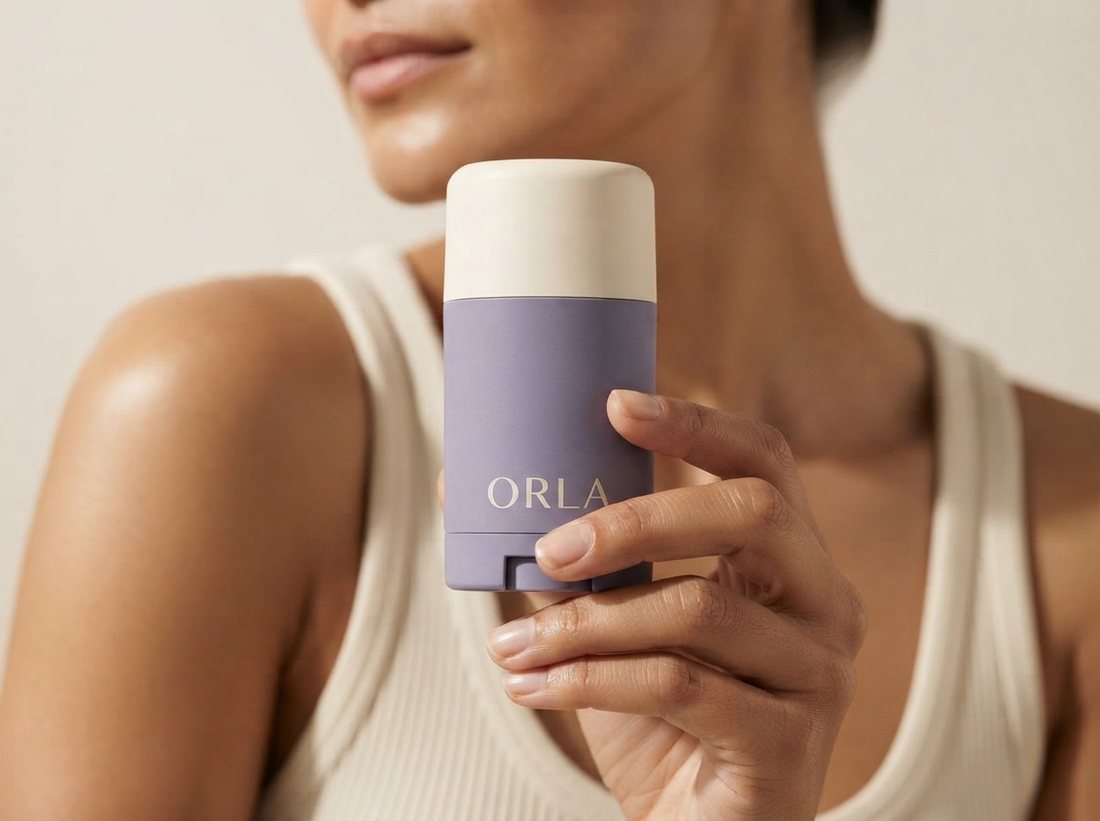
The model shotProduct first, person second. One hand, named as one hand.
Prompt 2, the photography
Shoot my product for this flow. Three images, and keep the product identical in all three.
1. The product on its own, standing upright, styled on a [warm oat plaster] surface, soft daylight from the left, one natural shadow. Leave space above it.
2. A close up of one hand holding the product, product sharp and filling most of the frame, a shoulder and jawline soft behind it. Exactly one hand and one forearm in the picture. Background [warm cream], and no [lavender] anywhere in the background so it does not compete with the packaging.
3. The product floating at a slight tilt on a plain background, lit evenly, nothing else in the frame. I want this one cut out.
No words, no logos and no graphics anywhere in any of these images, other than the wordmark that is printed on the packaging itself.
Photorealistic commercial product photography.
Returns all three shots, consistent with each other. About 5 minutes. Say "exactly one hand" out loud, because unnamed hands multiply.
How do you get the finished email design, not just the copy?
Ask for the layout to be built rather than drawn. This is the whole trick on this page.
An image model will happily produce something that looks like an email, and the words inside it will be wrong. Short strings like your brand name survive. Full sentences get dropped or scrambled, and you find out in front of a customer. So the photography gets generated, and the words get set as real type on top of it.
Prompt 3, the finished creatives
Now build the three emails as finished creatives, using the copy you wrote and the photography you shot.
Do not draw the text into the image. Build each email as a real layout so the headline, the body copy and the button are actual type, spelled correctly, in my brand fonts and colors. Use the photography as the image inside it.
Each email needs all of it: a preheader line, a small navigation row, my wordmark, the headline, the body copy, one button, and a footer with the price and an unsubscribe line.
Give each one a different background from my palette so the three do not look like the same email sent three times.
Then export each as an image I can drop into my email platform.
Returns the three finished emails. About 5 minutes. Every word is correct by construction, and every revision after this is an edit, not a re-roll.
How do you match a layout you have already seen? Optional
Send the layout you want instead of describing it. Two of the three emails on this page came from references I had saved, and the instruction is one line.
Adding a layout reference
I have attached a reference for the layout of email [number].
Use it only for [the structure and the arrangement of the elements]. Ignore its brand, its colors, its product and its words. Keep everything in my palette and my fonts.
Name the one thing you want from it. Adds nothing to the time. Left vague, it copies the other brand along with the layout.
The prompt chain, in order
#
Prompt
What comes back
0
The brand block
The standard everything else inherits
1
The three emails
Subject, preview, headline, body and button, three times
2
The photography
Hero shot, model shot, cutout shot
3
The finished creatives
Three email images with real type, ready to upload
+
The layout reference
Any of the three, matched to a layout you like
Things that make the difference
Give the brand once, at the top. One block naming the product, the palette, the type and the voice is worth more than correcting tone in every message afterwards.
One objection per email. Distraction, then doubt, then last call. If two emails answer the same thing, one of them is not earning its send.
Never let an image model write your copy. Ask for the photography clean and the words set as real type. A brand name survives. A sentence does not.
Only the last email discounts. Money in email one buys a sale you already had and trains everyone else to wait.
Approve the copy before any artwork exists. Changing a headline is free at step two and expensive at step four.
The checklist
Brand block pasted before anything else is asked for
Each email assigned one reason the person left
No discount in emails one and two
A real window on the offer in email three
Photography requested with no words in the picture
Headline, body and button set as real type, not drawn
Every word read back at full size before it goes into the platform
All three checked on a phone, not just on the desktop
How many emails should an abandoned cart flow have?
Three, and each one answers a different reason the person left. The first assumes they were interrupted, so it only reminds. The second handles price and doubt, so it argues the product. The third is the last call and it is the only one that discounts. Sending three versions of the same reminder trains people to ignore the flow, because the second and third add nothing the first did not already say.
Why give Claude a brand block before asking for the emails?
Because everything after it inherits from it. Without a brand block you get generic emails, then generic photography, then a design that matches neither, and you spend the session correcting tone one message at a time. With one block at the top naming the product, the price, the palette, the type and the two rules about voice, every asset in the flow comes back already consistent. It is the highest leverage paragraph in the whole build.
Should the first abandoned cart email include a discount?
No. Discounting in the first email teaches your list that abandoning a cart is how you get money off, and you pay that margin forever on people who were going to buy anyway. Most people who leave a cart were interrupted, not priced out. The first email should assume the interruption and do nothing but remind. Hold the discount for the third email, where it is the last thing you have left to say.
Why does text come back garbled inside AI generated email designs?
Because you asked an image model to write. Image models hold a brand name or a short phrase well and drop or scramble full sentences, and you often will not notice until it is in front of a customer. The fix is to split the job. Ask for the photography clean, with no words in the picture at all, and ask for the layout to be built so the headline, the body copy and the button are real type. Then the copy is correct by construction and every revision is an edit rather than another generation.
Can you build this flow before the product exists?
Yes, and it is one of the better uses of it. Describe the product, the packaging and the palette in the brand block and the photography comes back as if it had been shot. That gives you finished emails to test copy against, to show a partner or a buyer, and to load into your email platform before a single unit lands. If the product already exists, paste a photo of it instead and everything else in the flow runs the same way.
ORLA is not a real company. I invented the brand, the product and the price so the method could run end to end on something clean, and so you can see the whole standard in one place. Nothing here was commissioned. Every prompt is written to be filled in with your own brand and your own product.
About the strategist
Anne Reyes
Brand & AI strategist · Founder, Brandworks Studios
17 years building brands, and I scaled my marketing agency to 7 figures within 2 years, with clients including Amazon, Pier 1, and Dressbarn. I now build AI marketing systems for e-commerce brands through BAIBE, the Brandworks AI Brand Engine. AI does the production. Taste directs it.
Keep going
Want the next build?
The Chic Strategist breaks down a new AI marketing system every week. Or bring your brand to a strategy call and we'll build it together.