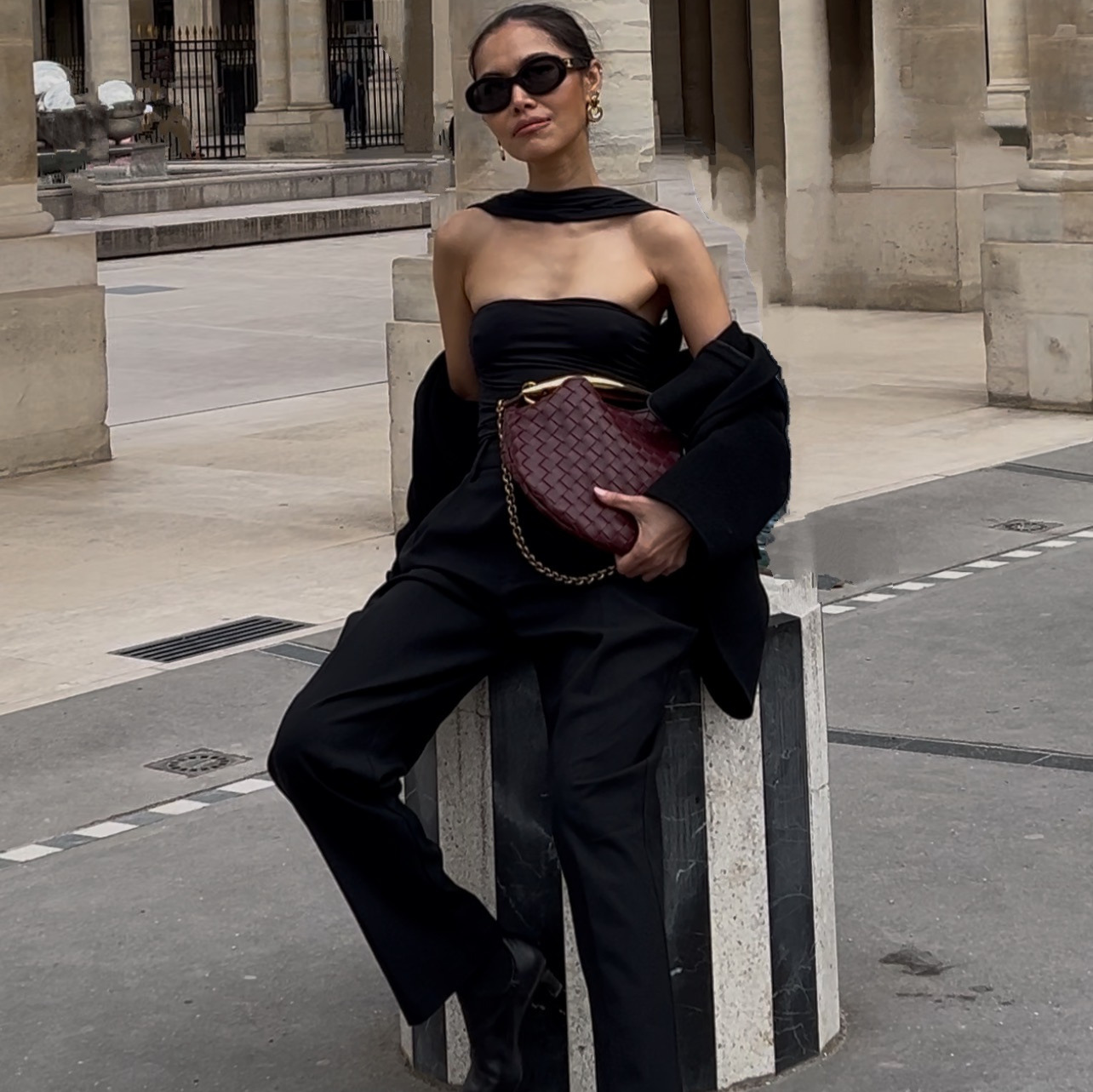
Black Friday is 100 days out today, and most stores will spend a chunk of those hundred days deciding on a discount before a single asset gets built. The store that starts today has a live campaign, a site banner, an ad set, an email and a pop-up, before the store down the category is out of that meeting.
This replaces the week a designer needs to turn one offer into four pieces that all look like they belong to the same campaign. If you already built a pop-up for an earlier project, this does not throw it out. It reuses it, and builds the rest of the campaign to match.
Below is the whole method, start to finish. You are not opening design software. You are describing the campaign in plain English and looking at what comes back.
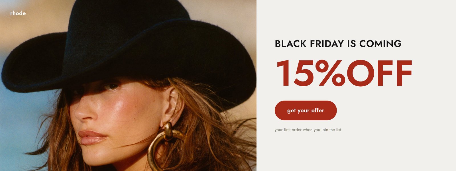
The whole campaign, in one lookSite banner, offer led, CTA and fine print locked in one look.
The whole thing on one page
| Step | What you do | How long |
|---|---|---|
| 1 | Hand Claude one product photo and your offer | 2 min |
| 2 | Ask for every placement at once, not one at a time | 1 min |
| 3 | Lock one look, color and font, across all of them | 1 min |
| 4 | Refine everything in a single message | 3 min |
What do you need before you start?
- One product photo. A plain hero shot or flat lay is enough. Claude is designing four layouts around it, not retouching it.
- Your Black Friday offer, decided. A percentage, free shipping, early access, whatever it is. It becomes the biggest thing on every asset, so it needs to be settled before you write the prompt, not while Claude is building.
- A locked color palette and font. Your own hex codes if you have them, or a reference brand's real published ones while you are finding your look.
What do you ask Claude to build?
The photo, the offer, and every placement, in one message, so nothing gets designed in isolation.
How do you keep four pieces looking like one campaign?
You lock the palette and the font before Claude touches a single asset, the same way you would hand a designer a brand board instead of a mood.
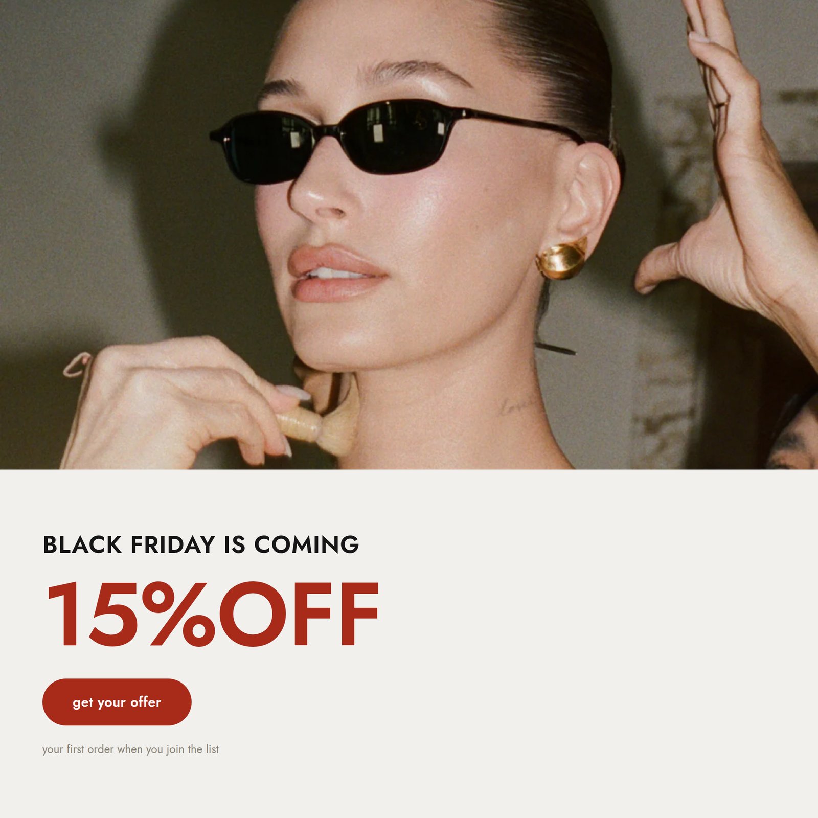
Square adSame look, same offer, sized for feed placements.
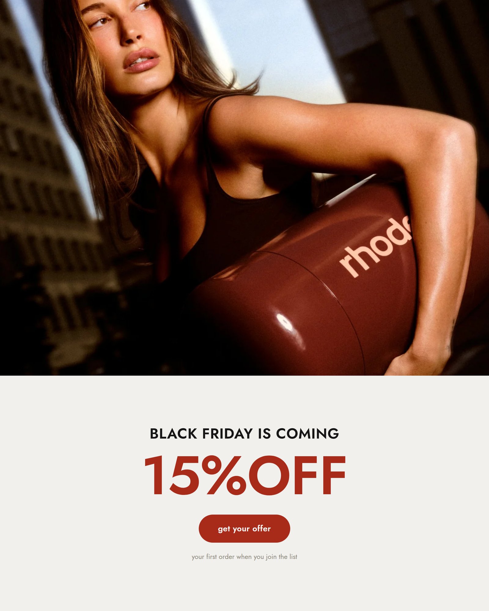
Portrait adSame look, same offer, sized for story and reel placements.
What if the first pass needs real changes?
Put every change in one message instead of fixing one asset at a time. Say exactly what gets bigger, what gets cut, which color, and which image goes where.
That one message does the work of a full revision round with a designer. Every specific change lands everywhere it applies, not just on the one asset you happened to mention.
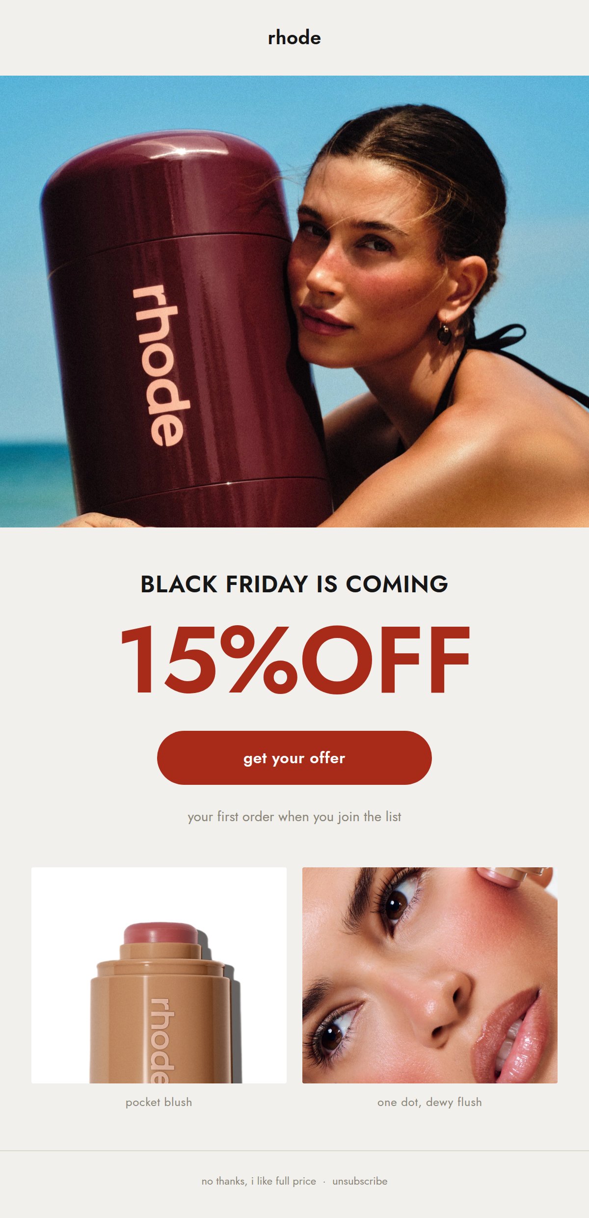
Email heroSame offer, same palette, the product photo doing double duty again at the bottom of the email.
Do you have to rebuild the pop-up too?
No. Reuse the one you already have and only change what is actually different about this campaign, the offer.
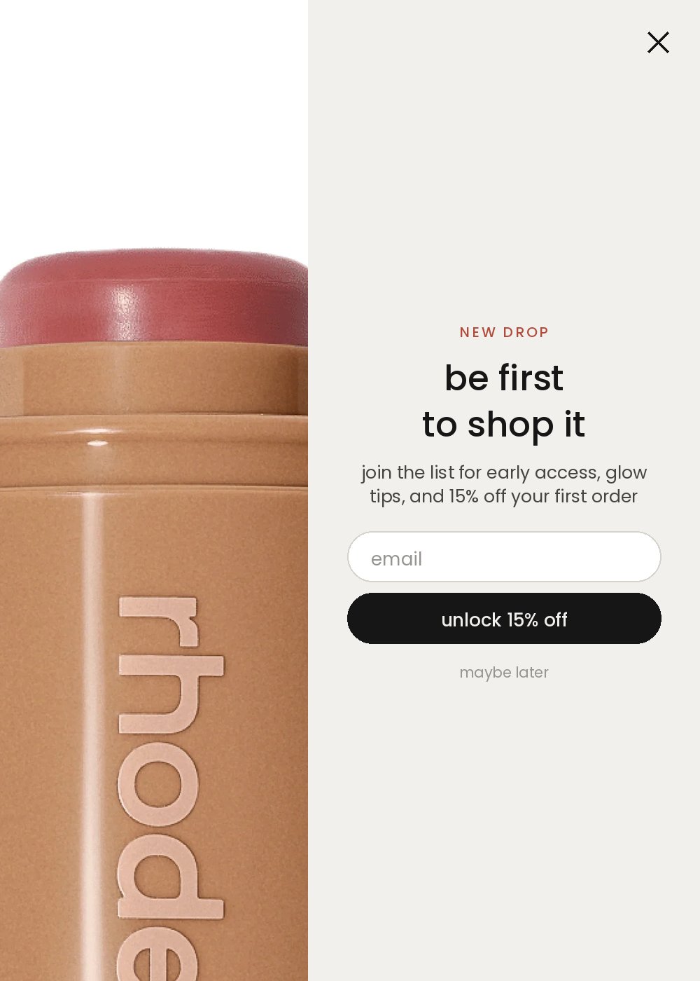
Reused, not rebuiltThe pop-up from an earlier build, same colors, same offer, no redesign.
Can you use your own brand instead of a reference?Optional
Yes, and once you have a locked palette this is the version you will run every time after this first one.
What does this look like on a real product?
The assets on this page are the actual output. I gave Claude one product photo and asked for a full Black Friday campaign styled like Rhode, a brand whose site never reads as a template. The offer holds across all four pieces, and the pop-up you see above is the same one built for an earlier guide on this site, reused with nothing more than the new headline.
What is the prompt chain, in order?
| # | Prompt | What you get |
|---|---|---|
| 1 | The brief | A first pass of all four pieces carrying the right offer |
| 2 | The one-look lock | The same palette and hierarchy held across every piece |
| 3 | The refine | Every specific change applied in one pass |
| 4 | Your own brand, optional | The same four pieces rebuilt in your own palette |
What makes the difference?
- Ask for every placement in one message, not one at a time. That is what keeps the look locked across all of them instead of drifting piece by piece.
- Name what should be biggest on the page. Leave it unsaid and the headline wins by default, and the offer gets buried under it.
- Reuse what already works. A pop-up built for an earlier campaign does not need a redesign, only the new offer.
- Refine everything in one message. Exact color, exact copy, which image goes where, all at once instead of one round trip per fix.
- Real hex codes beat a description. A color named from memory reads as almost right, which is worse than reading as different on purpose.
The checklist before it goes live
- Product photo ready
- Offer decided and worded exactly how it should read on every asset
- Palette and font locked, real hex codes not descriptions
- Site banner, ad set, email and pop-up all requested in one message
- Every asset checked against the others for one consistent look
- Files handed to whoever loads them into your site, ad platform and ESP
Do you need your Black Friday discount decided before you start?
You need it decided before you write the prompt, since the offer is the biggest thing on every asset. You do not need it locked forever. Swap the number later and ask Claude to update it across all four pieces in one message, the same way you would ask for any other single change.
Can you use a real brand's product photo as reference, or does it have to be your own?
You can use a brand's real published photography and colors as a styling reference while you are finding your own look, the same way a mood board works. Once you are shipping to real shoppers, rebuild with your own product photo and your own palette. The optional last prompt in this guide does exactly that swap.
How many placements should you ask for in one message?
Four is a full campaign kit: a site banner, one or two ad sizes, an email hero, and a pop-up. Asking for all four at once is what keeps them looking like one campaign instead of four separate projects. You can always add a placement later, a Pinterest pin or a second ad size, once the look is locked.
What if you already have a pop-up from a different project?
Reuse it. The whole point of locking one look before you start is that nothing already built needs to be redesigned when a new campaign starts, it just needs the new offer dropped in.
Can Claude build ad sizes for other platforms too?
Yes, as a separate follow-up once you know your channels. Tell it which platform and which placement, a Pinterest pin or a Google display banner, and ask for that size in the same locked look. That is outside what this guide covers, since the platform changes the exact dimensions.
The assets pictured on this page were built using Rhode's own publicly available product photography as a styling reference, and its published palette, Cararra #F1F0ED and Cod Gray #161616, extended with a red sampled from Rhode's own campaign photography for the offer callout. Rhode is not a client of mine, this was not commissioned by or shown to the brand, and I am not affiliated with them. The pop-up shown above is the same one built for an earlier guide on this site. Every prompt above is written with brackets so you can drop in your own brand, your own offer and your own product photo in place of the reference.