A product about to launch usually has more interest than it has anywhere to put that interest. Someone sees it in a story or a photo on your feed, wants to be first when it drops, and there is nowhere to leave an email until launch day. That intent shows up for a few seconds and then it is gone, because the page that would have caught it does not exist yet.
A waitlist page is normally either a web designer's invoice or a page builder subscription and an afternoon of dragging blocks around a template that looks like every other template. Neither is difficult exactly. Both just take longer than the window where the interest is actually there.
Below is the version where the page gets built in the same conversation where you decide to build it. Your product photo and your launch details in, a finished page out: a hero, a signup form, the reasons to join now, and the offer for waiting.
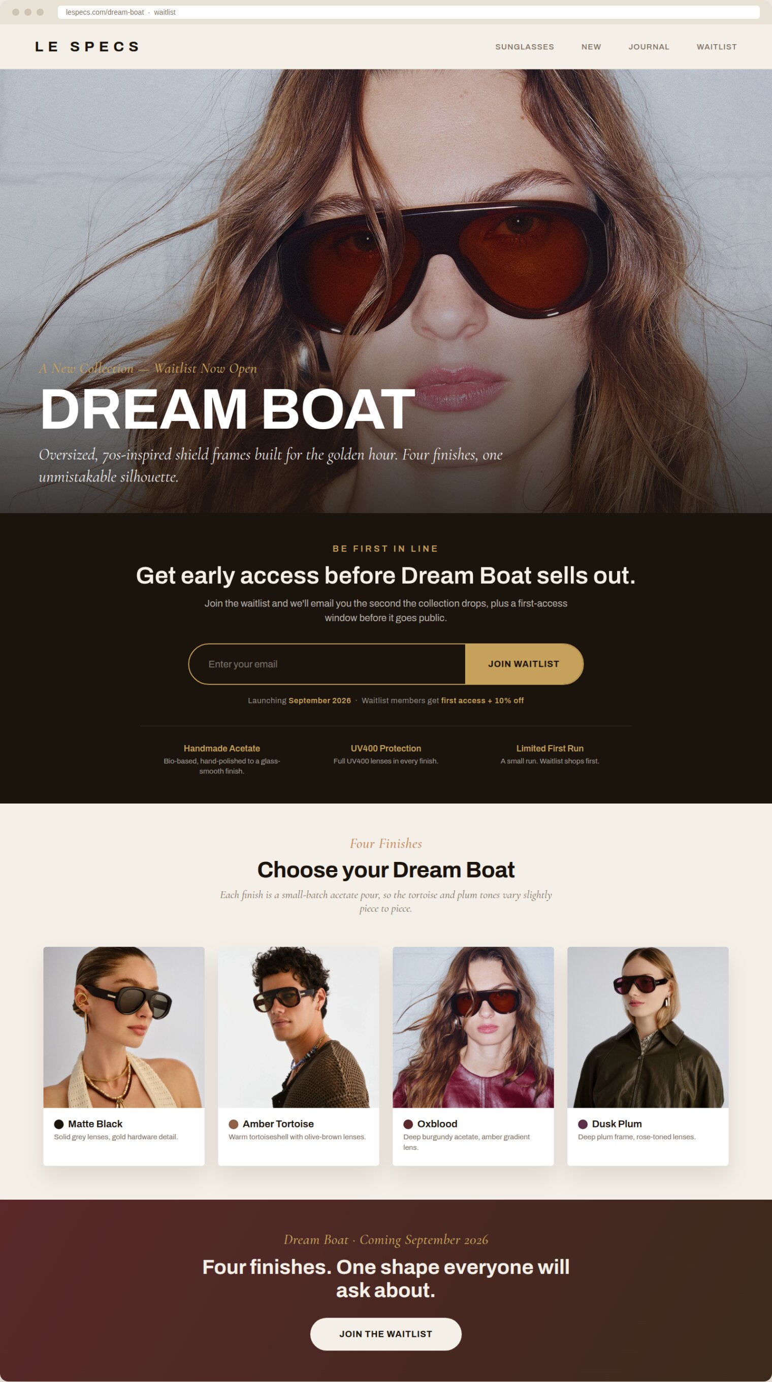
The full page, built from a product photo and a launch briefHero, signup form, the reasons to join, the finishes grid, and the closing offer, all in one page, top to bottom.
What do you need before you start?
Two things.
- Your product photo. An iPhone shot is enough. More than one photo if you are launching more than one color or variant.
- Your launch details. What the product is, who it is for, the one real thing that makes it different, the offer for joining the waitlist if there is one, and the launch date.
The whole thing on one page
Four steps, one optional. Each is a single message to Claude.
| Step | What you do | How long |
|---|---|---|
| One | Give Claude the brief | 2 minutes |
| Two | Build the page | 4 minutes |
| Three | Tighten it | 2 minutes |
| Four | Read it back cold | 2 minutes |
Step oneGive Claude the brief
Everything the page will say comes from this one message. Vague inputs make a vague page, so put the real specifics in, not a placeholder you plan to fix later.
Step twoBuild the page
This is the step that replaces the designer. Ask for the finished thing, not a description of it.
Step threeTighten it
A first pass almost always runs long, because it is trying to sell everything at once. Cutting it down is a normal second step, not a fix for a bad first draft.
OptionalRebuild it after a page you already likeOptional
If you have a waitlist page you think does this well, point Claude at the structure of it, not the copy.
Step fourRead it back cold
You already believe in the launch, which makes you the wrong person to judge whether the page earns an email address from someone who has never heard of you.
What did this look like as a real build?
I ran this on a real collection about to launch: Le Specs' Dream Boat, an oversized, 70s-inspired shield sunglasses frame coming in four finishes. The brief was the four product photos Le Specs has published for the collection, the finish names visible in each one, matte black, amber tortoise, oxblood, and dusk plum, and the collection's own positioning, built for the golden hour.
The first pass came back as a complete page: navigation, a hero over the darkest of the four photos, a signup band with the launch window and the joining offer, and a finishes grid that put all four photos to work instead of just the one from the hero. It also ran long, the kind of long that loses a visitor before they reach the form. The tightening step, the same one above, cut the page by about a third without dropping the form, the offer, or a single finish from the grid.
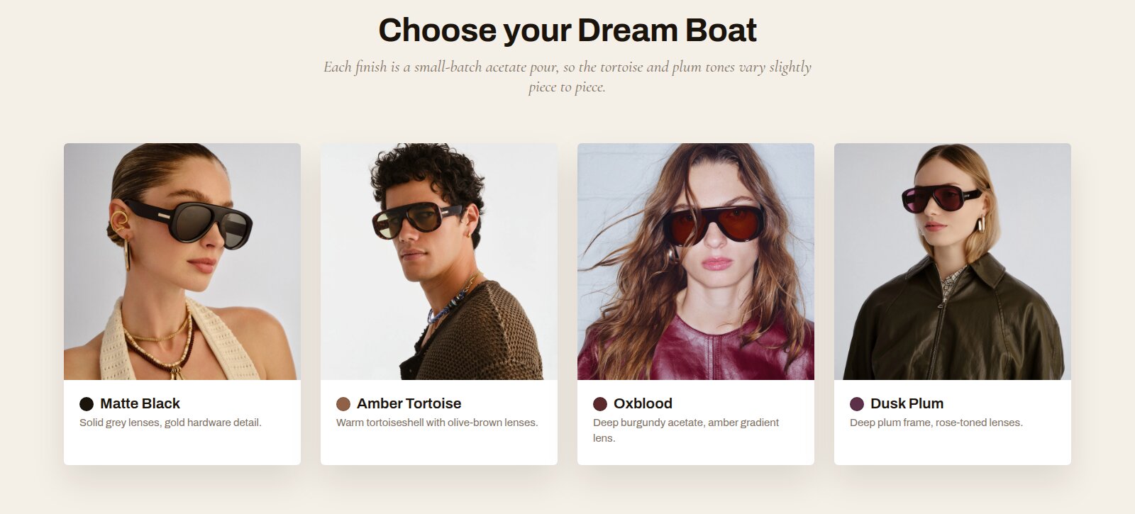
One photo becomes four data pointsThe same brief that built the hero also built the finishes grid, no extra step.
The build shown here uses Le Specs' own publicly published product photography as reference. Le Specs is not a client of mine and this was not commissioned by or shown to the brand. The launch date, the offer, and the finish names are placeholder copy standing in for a real brief, not confirmed details from Le Specs. Swap in your own product photos, offer, and launch date and the same prompts build your page instead.
What is the prompt chain?
In order, so you can run the whole thing without stopping to think about what comes next.
| Prompt | What it does | What you get |
|---|---|---|
| One | Sets the brief | The one sentence the page gets built around |
| Two | Builds the page | Hero, signup form, reasons to join, offer |
| Three | Tightens it | The same page, shorter |
| Four | Rebuilds after a reference, optional | Your page, their structure |
| Five | Reads it back cold | A yes or no, and what's missing |
What makes the difference?
- The offer is specific, not just "be the first to know." A real reason to leave an email today instead of waiting for launch day itself.
- The signup form sits high. If it is below a full page of copy, most people never scroll far enough to find it.
- One photo is not a limit. More than one becomes a finishes or colorway grid, so the page proves there is a real collection, not just a placeholder.
- The tightening pass is not optional. A first draft runs long because it tries to sell everything at once. Cutting it is what makes someone actually read it.
- No invented urgency. A real launch date and a real offer for joining early, nothing manufactured.
What does this replace?
A waitlist page before a launch used to mean briefing a web designer and waiting on a turnaround, or paying for a page builder and spending an afternoon inside a template that looks like everyone else's template. That is the part this replaces: the gap between deciding you want a waitlist page and having one live.
One honest limit. The page catches an email address, it does not sell the product. What sells the product is still the offer, the price, and whether the thing is actually worth waiting for. The page's only job is to be there, and to be worth filling out, in the window when someone already wants in.
The checklist before you publish
- Real product photo, not a placeholder or a stock image
- Launch details are specific: what it is, who it's for, what's different, the offer, the date
- Signup form visible without scrolling past the hero
- Page has been tightened, no section repeats what an earlier one already said
- Read back cold, and it still earns the email
What actually needs to be on a waitlist page before a product launches?
A hero that shows the product, one sentence on why it is worth waiting for, a signup form visible without scrolling, a short list of reasons to join now instead of at launch, and the offer for joining early if there is one. Everything else is optional.
How do you get Claude to design the whole page instead of just writing the copy?
Ask for the finished page directly. Build it as one finished page I can send someone to, not a wireframe or a description of one, is the line that does it. Asked for copy alone, Claude writes copy alone.
What if the page comes out too long?
Tighten it in a second message rather than starting over. A first pass usually tries to sell everything at once, and cutting it down to what actually needs to be said is a normal second step, not a sign the first pass failed.
Is it okay to build the page around a reference page I already like?
Yes, as long as you are using your own copy, photos and colors, and only borrowing the structure: the order the sections come in and what each one does. Copying another brand's actual copy or design is a different thing.