A pop-up form is the first thing a shopper sees on your site that either looks like your brand made it or looks like every other pop-up tool's default template with your logo dropped in. Most brands ship the template, because the alternative is a designer, a brief and a week of back and forth for one screen.
This replaces that week. Give Claude one product photo and a locked color palette, your own if you have one, or a brand's real published colors if you are still finding yours, and it will design the layout, the headline hierarchy and the button around them in minutes.
Below is the whole method, start to finish. You are not opening design software. You are describing what you want in plain English and looking at what comes back.
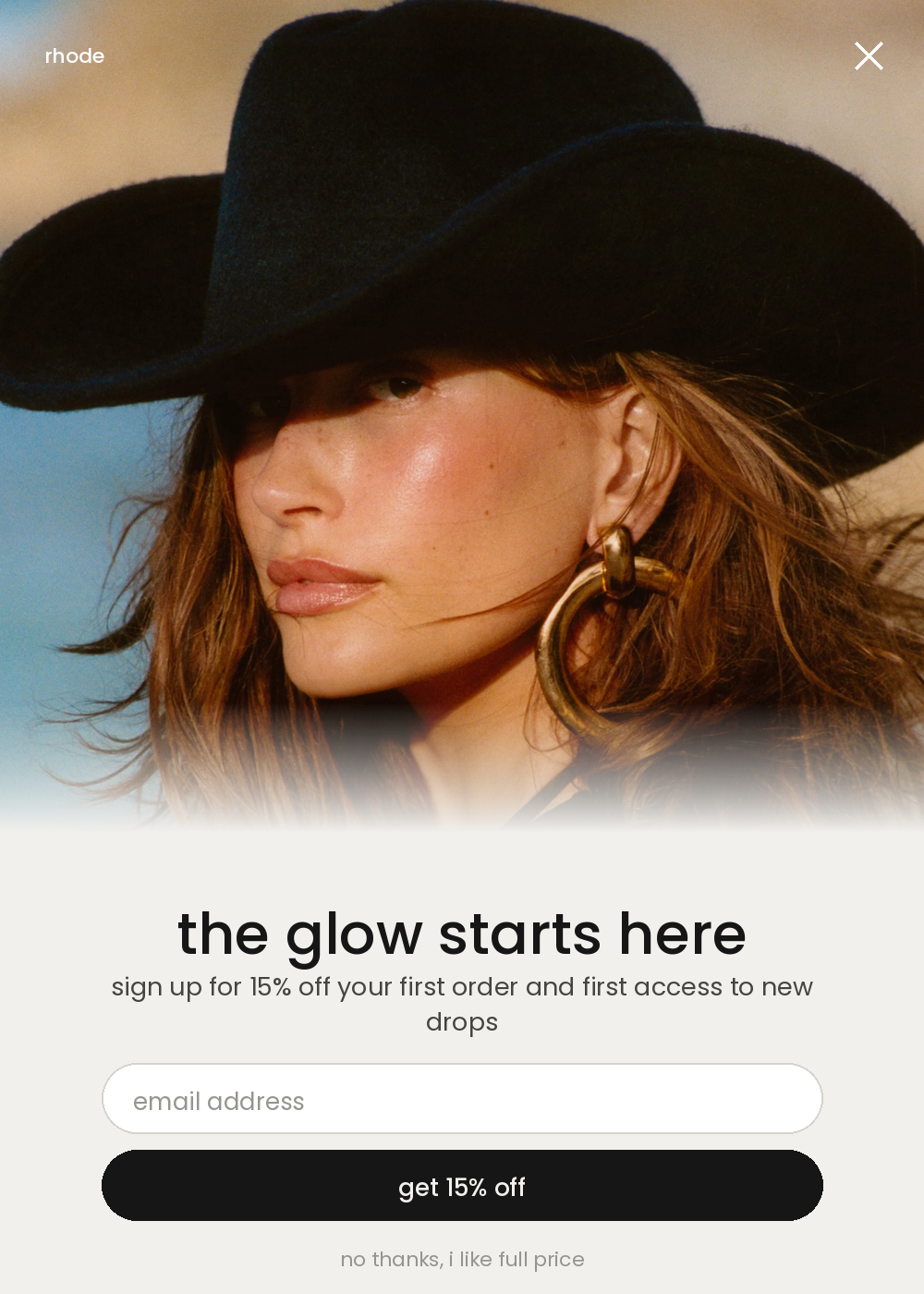
Concept oneFull-bleed photo, copy panel underneath.
The whole thing on one page
| Step | What you do | How long |
|---|---|---|
| 1 | Hand Claude your product photo and your color palette | 3 min |
| 2 | Ask for pop-up concepts, not just "a pop-up" | 2 min |
| 3 | Make the concepts genuinely different from each other | 3 min |
| 4 | Refine the one you are keeping | 1 min |
What do you need before you start?
- One product photo. A plain hero shot or flat lay is enough. Claude is designing a layout around it, not retouching it, so it does not need to be studio quality.
- A locked color palette. Your own brand's hex codes and font if you already have them, or the real published colors of a brand whose look you are borrowing for the exercise. A guess from memory reads as slightly off. The real hex code does not.
Where do you get a brand's real colors, not a guess?
You ask Claude to look them up, the same way you would look up anything else you did not have memorized. Skip this step entirely if you already have your own brand's hex codes on hand.
What do you ask Claude to actually build?
The brief and the photo, in one message, so Claude is designing around your product instead of a placeholder.
"Three different" is doing the heavy lifting in that sentence. Ask for one pop-up and you get one pop-up. Ask for three without saying more and you often get the same layout three times with different words in it, which is the next prompt's job to fix.
How do you get three concepts that actually look different?
You name the layouts instead of leaving it to chance.
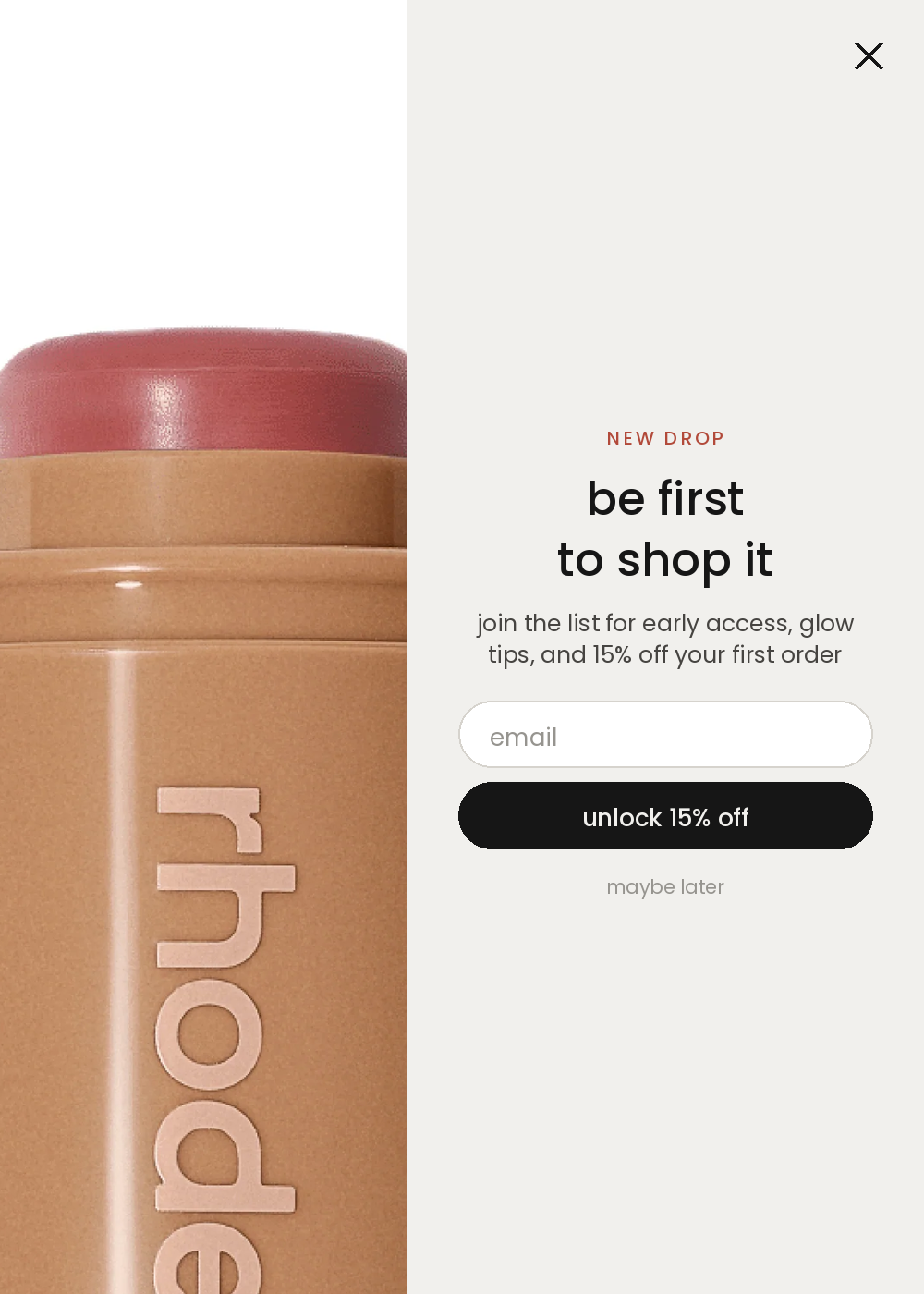
Concept twoSplit screen, photo left, form right.
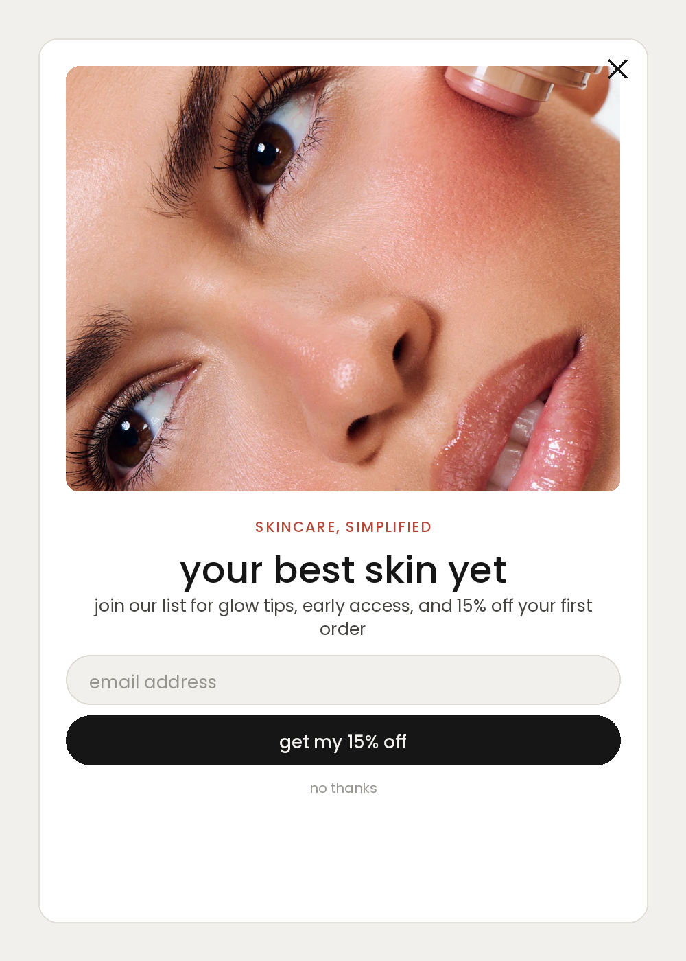
Concept threeBoxed card, photo inset at the top.
How do you fix the one you are keeping?
One line, one change, and you say what to leave alone.
Ask for one change on the concept you are keeping, not a full regeneration. That way the version you already approved stays the version you approved, with only the one thing you flagged now gone.
Can you use your own brand instead of a reference?Optional
Yes, and once you have a locked palette this is the version you will run every time after this first one.
What does this look like on a real product?
The three pop-ups on this page are the actual output. I gave Claude three product photos and asked for pop-ups styled like Rhode, a brand whose site never reads as a template. The first version of one concept had an internal label baked into the design, a leftover from my own content calendar. Prompt 4, remove that label, keep everything else exactly as it is, and the fix landed with nothing else on the page disturbed.
What is the prompt chain, in order?
| # | Prompt | What you get |
|---|---|---|
| 1 | The palette check | A brand's real hex codes, if you are borrowing a look |
| 2 | The brief | A first pop-up concept in the right colors |
| 3 | The variety | Three concepts with genuinely different layouts |
| 4 | The fix | The one you are keeping, refined by exactly one change |
| 5 | Your own brand, optional | The same layouts rebuilt in your own palette |
What makes the difference?
- Use a brand's real hex codes, not your memory of their vibe. A palette that is off by a shade reads as almost right, which is worse than reading as different on purpose.
- Name the layouts you want instead of asking for "three pop-ups." Variety is a specific instruction, not something Claude assumes you want.
- Keep the copy to one headline, one line and one button. A pop-up trying to say four things says nothing in the two seconds a shopper gives it.
- Always include the close link. A pop-up a shopper cannot easily dismiss reads as a trap, not an offer.
- Refine with one change at a time. Asking for a full regeneration to fix one label risks losing the layout you already approved.
The checklist before it goes live
- Product photo ready, more than one if you want real variety across concepts
- Palette locked, your own hex codes or a reference brand's real published ones
- Three concepts requested with the instruction to make them different from each other
- Headline, one line of copy, email field, button and close link present on every concept
- The concept you are keeping refined with one specific change
- Files handed to whoever builds it into your pop-up tool
Do you need design software to build a pop-up this way?
No. Claude generates the finished pop-up as an image inside the chat, and that image is what you hand to whoever builds it into your pop-up tool. You are describing the design in English, not opening a canvas.
Can you use another brand's colors for your own pop-up?
You can use a brand's real published colors as a styling reference while you are finding your own look, the same way a mood board works. Once you are shipping the pop-up to real shoppers, rebuild it in your own brand's palette and your own product name, since a shopper who lands on a page that echoes another brand too closely is a confusion problem, not a style choice. The optional last prompt in this guide does exactly that swap.
How many pop-up concepts should you ask for?
Three is usually enough to see genuinely different layouts without spending the next twenty minutes comparing near duplicates. Fewer than three and you cannot tell if you like the layout or just the only option you saw. More than four and the differences start blurring together.
What if your product photo is not great quality?
Use it anyway for this exercise. Claude is designing the layout, the color blocking and the copy around the photo, not retouching the photo itself, so a phone shot works for testing which layout you want. Swap in the final studio image once you know which concept you are building for real.
Can Claude turn the finished concept into working code?
Yes, as a separate follow-up once you know which concept you are keeping. Tell it which pop-up tool you use, Klaviyo, Privy, Justuno, or your theme's native pop-up, and ask it to build that concept as the actual embed code. That is outside what this guide covers, since the tool you build for changes the answer.
The three pop-up concepts pictured on this page were built using Rhode's own publicly available product photography as a styling reference, and its published palette, Cararra #F1F0ED and Cod Gray #161616. Rhode is not a client of mine, this was not commissioned by or shown to the brand, and I am not affiliated with them. The colors were sourced via Brandfetch. Every prompt above is written with brackets so you can drop in your own brand and your own product photo in place of the reference.