Four builds. Every prompt is written to paste, with the brackets for you to fill in.
How do I rewrite my product page in my customers' own words?
Step 1Build the reviews file
Thirty reviews for one product, newest first. Every star rating, not just the fives. The threes and fours are where the objection lives.
The file shape
# [Product name], 30 reviews
- "review text exactly as written"
5 stars, [where it was posted], verified buyer
- "review text exactly as written"
3 stars, [where it was posted], verified buyer
Step 2Mine it, then rewrite the page
The rewrite prompt
Read all 30 reviews in reviews.md. Do not use anything you know about this product from outside the file.
Give me four things.
1. THE PHRASES THAT REPEAT
Exact wording, not a paraphrase. For each phrase, tell me how many of the 30 reviews use it or a close variant, and quote two of them. Rank by frequency. Ignore anything that appears only once.
2. THE OBJECTION
The hesitation or complaint that comes up most. Quote three reviews that raise it. Tell me whether my current page addresses it at all.
3. WHAT SURPRISED THEM
Anything a reviewer says they did not expect. These are the lines that convert, because no brand thinks to write them.
4. THE WORDS I USE THAT THEY NEVER USE
Compare my current page copy, pasted below, against the reviews. List the marketing words that appear on my page and in zero reviews.
Then rewrite my product page.
Rules for the rewrite:
- Use the phrases from section 1, in the customers' wording
- Answer the objection from section 2 inside the copy, do not dodge it
- Lead with the thing from section 3
- Cut every word from section 4
- Quote nothing you cannot find in reviews.md
- No adjectives a customer did not use first
Give me: one product title, one description of 40 words or fewer, three bullets, and one line for the buy button area.
MY CURRENT PAGE COPY:
[paste it here]
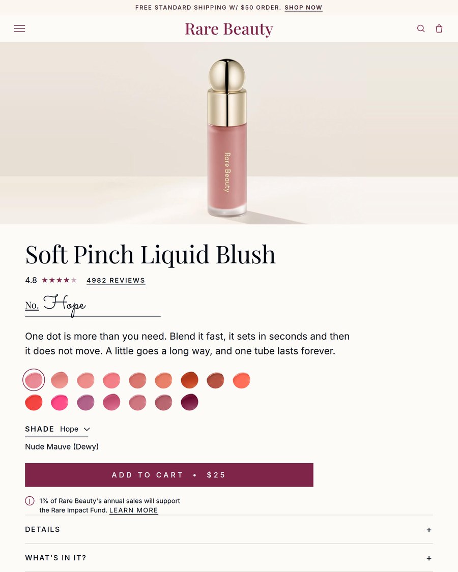
How do I get three pop-ups and a campaign banner from one hero shot?
Step 1Get the real palette, not a guess
The palette check
Look up [brand name]'s actual published brand colors and give me the hex codes. I want their real palette, not a description of the vibe.
Step 2Brief the three pop-ups
The pop-up brief
I want three different email pop-up sign-up forms for [your brand or product]. Use my colors, [hex codes], and a clean rounded sans-serif typeface. Here is the product photo to build the design around: [attach photo].
Each pop-up needs a headline, one short line of supporting copy, an email field, a button, and a small link that lets someone close it without signing up.
Step 3Force three real layouts
The variety prompt
Make the three concepts genuinely different layouts, not the same design with different copy. For example: one full-bleed photo with the form underneath, one split screen with the photo on one side and the form on the other, and one boxed card with the photo inset at the top and the form below it.
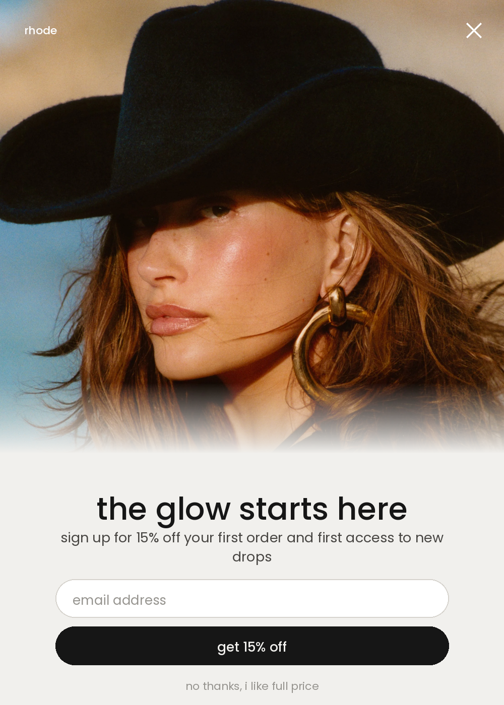
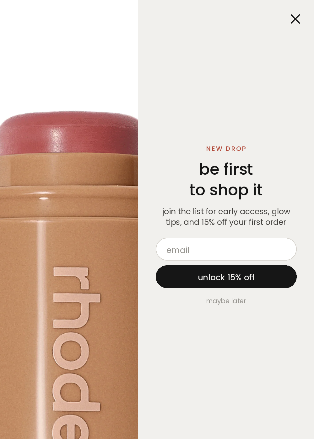
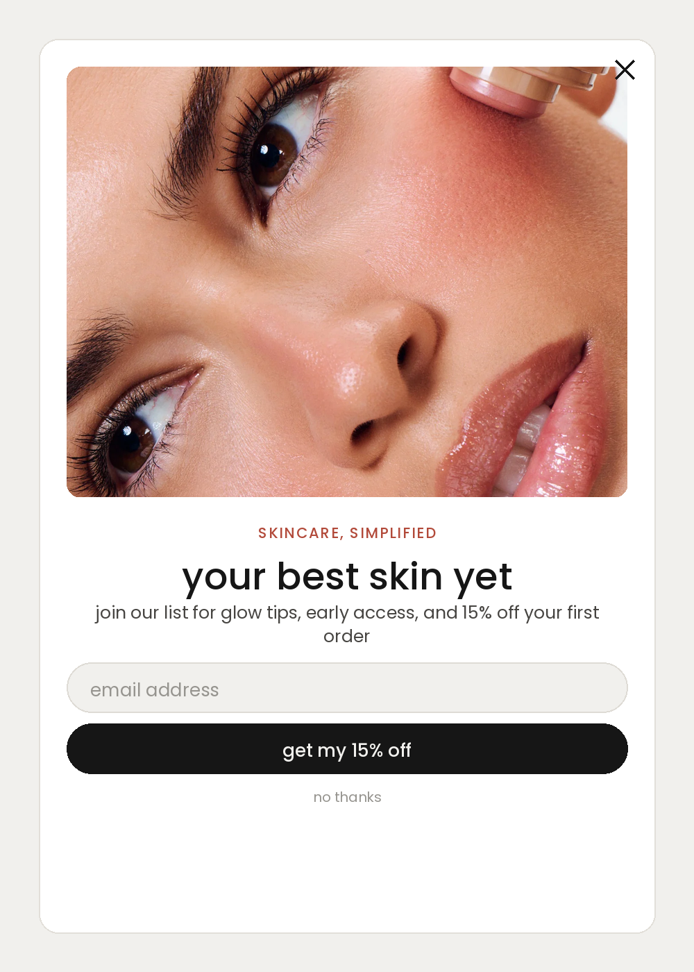
Three layouts, one palette, one product photo.
Step 4Take the same offer across the campaign
The campaign brief
I'm building a campaign for [your brand]. Here's my product photo: [attach photo]. My offer is [your offer, for example 15% off your first order]. Build the whole campaign in one look: a site banner, a square ad, a portrait ad, an email hero, and reuse the pop-up above with the same offer.
Step 5Lock the one look
The one-look lock
Hold the same colors, [hex codes], and the same typeface, [font name], across every piece. [Your offer] should be the biggest thing on the page, bigger than the headline above it.
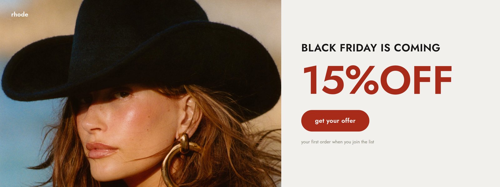
How do I design a print-ready insert card?
Step 1The brief, with one ask only
The brief
I'm designing a packaging insert card for [your brand]. Here's my product photo: [attach photo]. My brand colors are [hex codes] and my font is [font name]. Design both sides of a 4 x 6 inch insert card. The one thing I want the customer to do is leave a review at [your review destination].
Step 2Say what goes on each side
The two sides
Front: brand mark, a thank you that sounds like a person wrote it, one supporting line, and the product photo bleeding up from the bottom. End with a short line that gets the card flipped without naming what's on the back. Do not put the offer on the front.
Back: my one ask, the QR code, and the incentive last. Nothing else.
Step 3Add the QR and the scaffolding
The QR prompt
Add a QR code pointing to [your review URL], sized at least 0.8 inches square with clear space around it, error correction level H. Under it, add a short "not sure what to write?" list with three specific prompts about my product, [describe what your product is and how people use it].
Step 4Put the incentive last, and keep it compliant
The incentive prompt
Add the incentive at the bottom in a contained block so it reads last, not first: [your incentive]. Include a short line stating the review does not need to be positive to qualify. Keep it plain, not legalistic.
Step 5Ask for a file a printer can open
The print spec
Output both sides at 4 x 6 inches trim with 0.125 inch bleed on all four sides, at 300 dpi. Keep all text and the QR code inside a safe area inset 0.1875 inches from the trim edge. Give me both sides as a two page PDF.
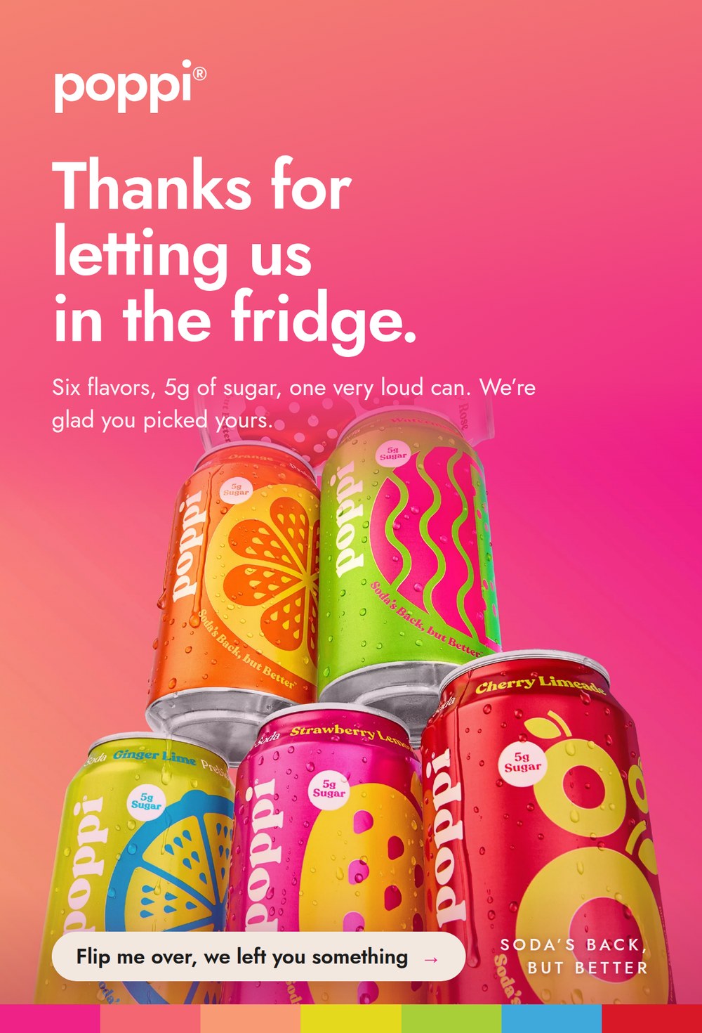
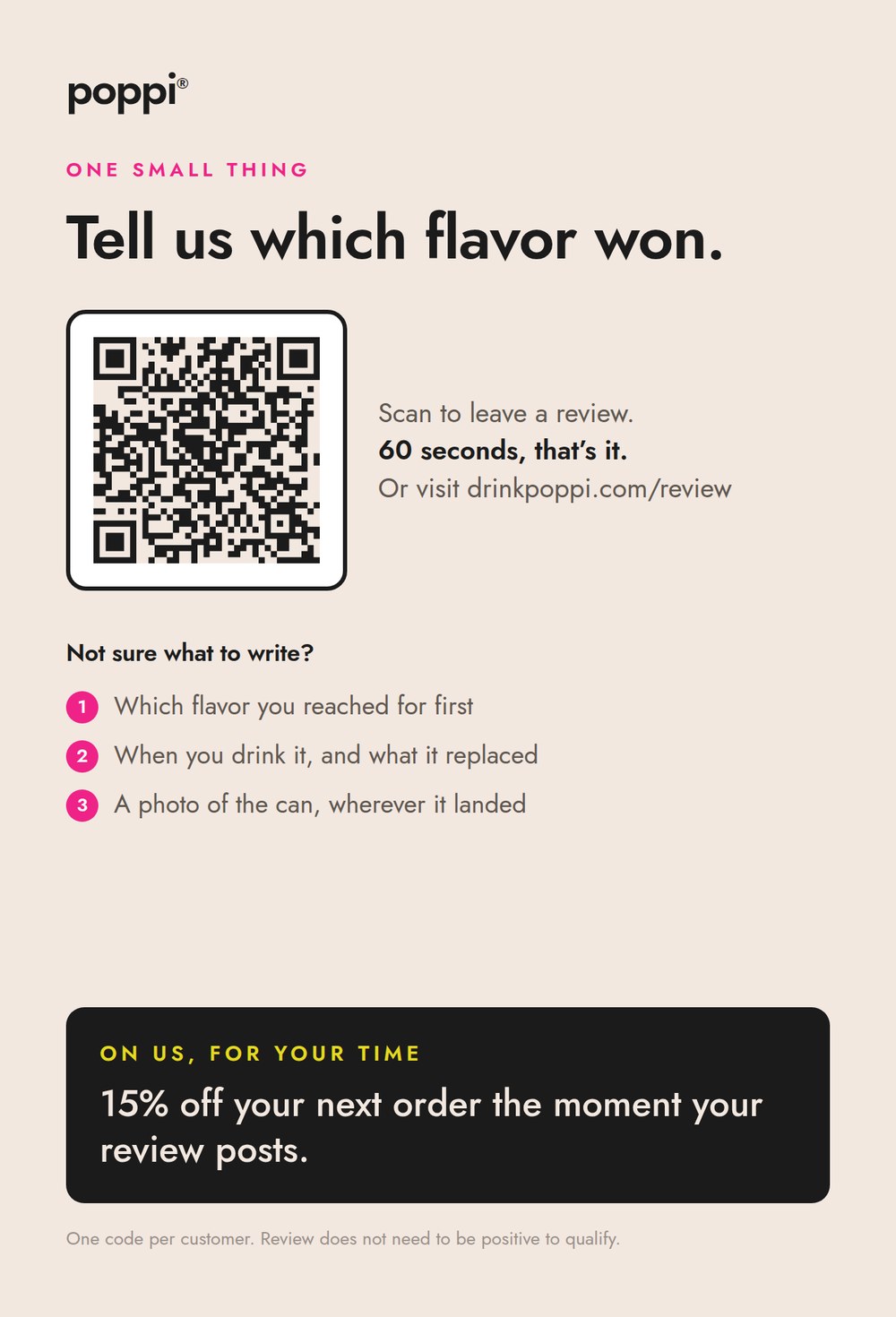
Both sides, print ready at 300 dpi.
How do I turn one bottle into a library of lifestyle scenes?
Step 1Get the settings before you touch the photo
The settings list
Look at [your brand name] and [a link to your product page or your Instagram]. Based on this brand's actual visual world, its colors, its cultural references, its aesthetic, give me [how many you want] specific real-world settings, not generic categories, that a photo of [describe your product in one line] could be placed into. Name real places and real details, the way "the wave-pattern mosaic pavement of a Rio boardwalk" is a real place and "a beach" is not. For each setting, tell me what it is for: my grid, an email header, or an ad background.
Step 2Run one setting at a time
The scene prompt
Generate an editorial lifestyle photo of [describe your product in one line: category, color, distinctive shape] in [paste one setting from your list]. The product should be small and clearly secondary in the frame, occupying roughly 10 to 15 percent of the image, with the setting itself as the true subject. Keep the product's shape, color, label, and every printed detail exactly as shown in the reference photo. Do not redesign, restyle, or reinterpret the product. Only change the environment, lighting, staging, and crop around it.
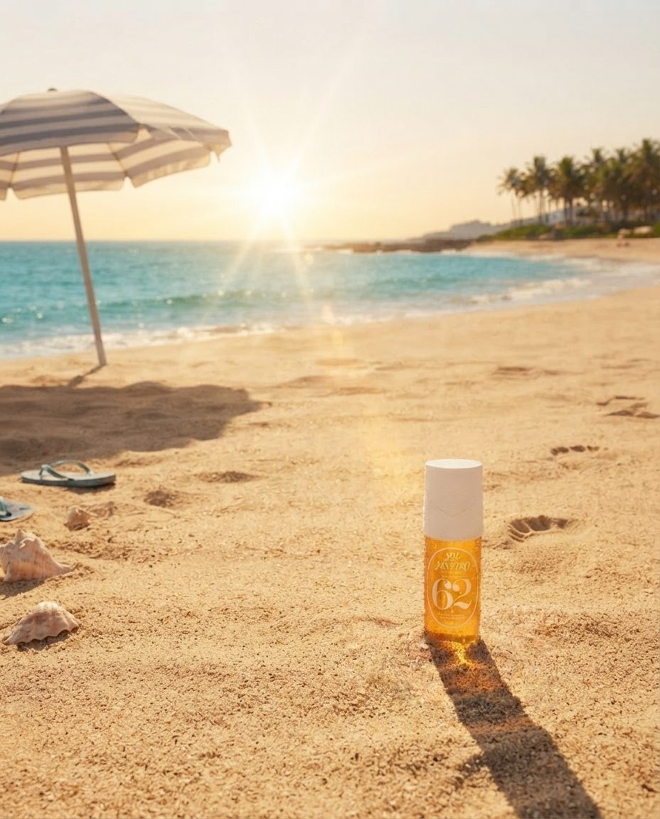
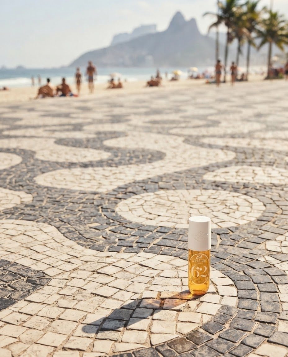
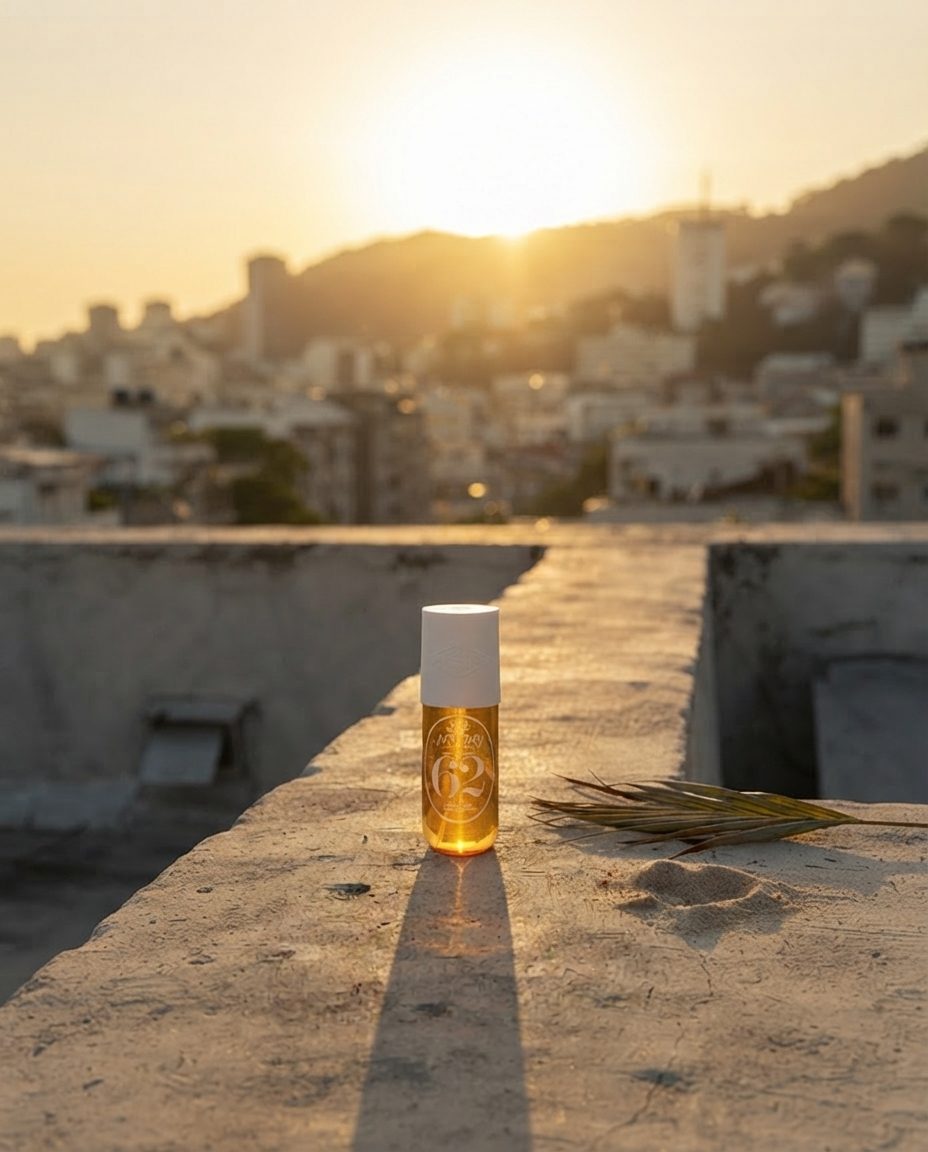
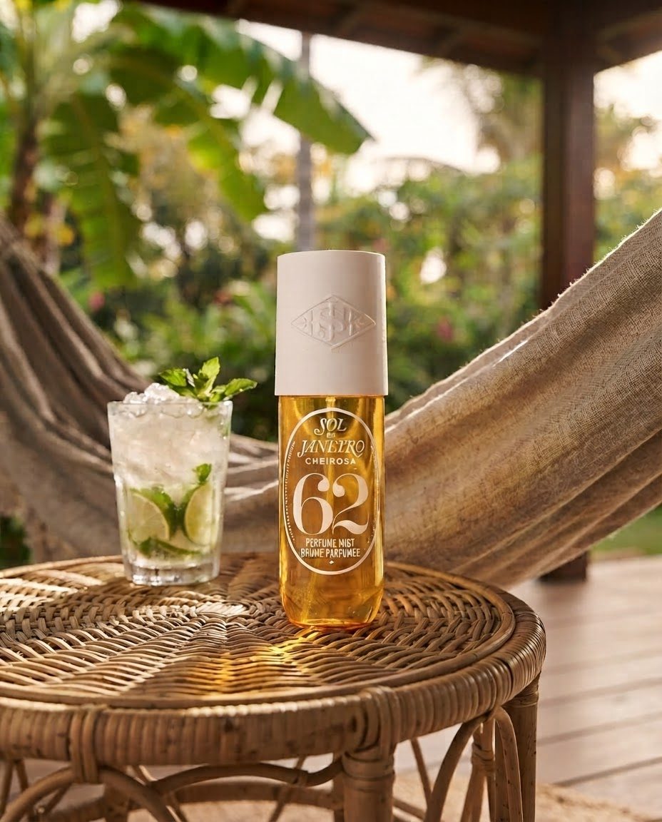
Four from one bottle. Same label every time, none of it shot.