Seventeen years in branding taught me that the most expensive thing in a box is rarely the thing that earns its keep. Brands spend on the mailer, the tissue, the sticker, the ribbon. Then the customer has a good experience, feels warm about it for about four minutes, and never tells anyone.
The piece that changes that costs a few cents and fits in the palm of your hand. It is the insert card. Not the one that says "thanks for your order" and nothing else, which is a coaster. The one that asks for exactly one thing and makes it easy to do standing in the hallway with the box still open.
This replaces the back and forth with a designer for a piece most brands treat as an afterthought, and it gets you something a designer usually will not hand you on the first pass: both sides, laid out to a real print spec, ready to send to a printer today.
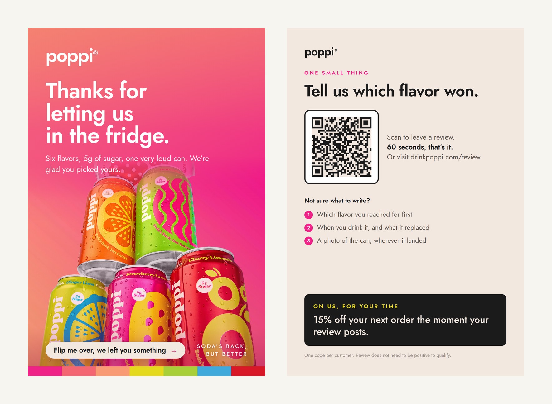
Both sides, print readyOne product photo, one brand kit, one ask. 4 x 6 inches with bleed, ready for the printer.
The whole thing on one page
| Step | What you do | How long |
|---|---|---|
| 1 | Hand Claude one product photo and your brand kit | 2 min |
| 2 | Split the card into two jobs, front and back | 1 min |
| 3 | Write the one ask, and remove every other ask | 2 min |
| 4 | Add the QR code and the scaffolding under it | 2 min |
| 5 | Ask for the print spec, not just the artwork | 1 min |
What do you need before you start?
- One product photo. A hero shot or a flat lay on a plain background works best, because the card is small and a busy photo turns to mud at four inches.
- Your brand kit. Hex codes, font names, logo file. Real values, not descriptions. "Warm pink" gets you a different card every time you run it.
- A decision about where the review goes. Your own product page, a review platform, a Google listing. This is the destination the QR code points at, and you cannot design the back without it.
- A decision about the incentive, or no incentive. Both work. What matters is that it is settled before you write the prompt, because it changes the hierarchy of the whole back of the card.
What do you ask Claude to build?
One photo, the brand kit, and both sides in the same message. Asking for the front first and the back later is how you end up with two cards that do not look related.
What goes on the front, and what goes on the back?
The front has one job, and it is not the one people give it. The front's job is to get the card turned over. That is all. Everything that actually does work, the ask, the code, the incentive, lives on the back.
Which means the worst thing you can put on the front is the offer. A card that says "15% off inside" has already spent the only thing it had. It gets read at the top of the bin. A card that promises something without naming it gets turned over, and the turn is what puts the QR code in front of a customer who is already holding it.
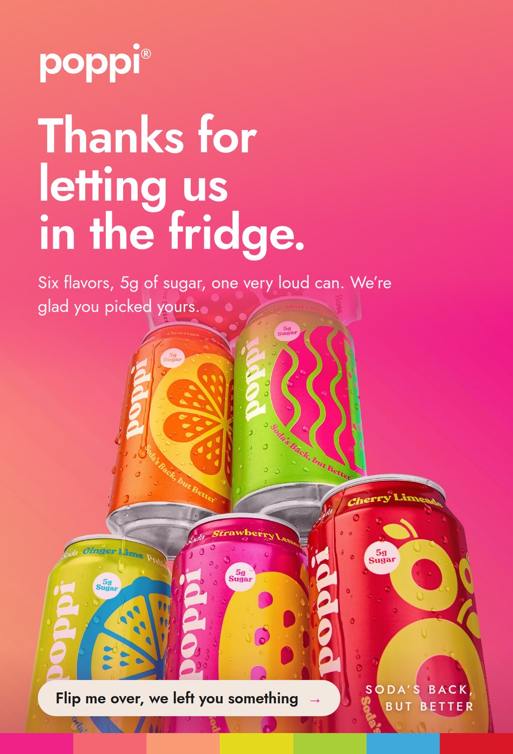
The frontNo offer, no second ask. One line whose only job is to get it flipped.
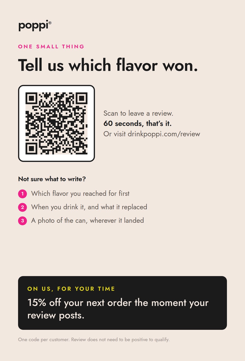
The backOne ask, the code, three prompts, and the incentive reading last.
Why does the card only get to ask for one thing?
Because a card that asks for a review, a follow, a referral and a newsletter signup gets none of them. Every extra ask is a decision, and a customer standing over a recycling bin does not make four decisions. They make zero and drop the card.
Pick the ask that is worth the most to you right now. For most stores under a few thousand orders that is reviews, because reviews are the thing that makes every future ad and every product page work harder, and because they are the one asset you cannot buy your way to honestly.
Then cut the rest. Your social handles can sit small at the foot as information. They are not an ask if nobody is being told to do anything with them.
How do you get the card actually scanned?
Two things stop a scan. The code does not work, or the customer does not know what to say.
The first is a print problem and it is solved in the spec. The second is the real one, and it is solved with three lines. Blank page paralysis is not a writer's problem, it is everyone's problem, and "leave us a review" is a blank page. Put a short prompt list under the code and you remove it.
Error correction level H is not a detail to skip. It lets the code still scan when the print is trimmed slightly off, when the card gets a thumbprint on it, or when you drop a logo into the middle of it later.
What about the incentive, legally?
You can offer one. What you cannot do is tie it to the review being good.
The FTC's Rule on the Use of Consumer Reviews and Testimonials took effect on October 21, 2024. It prohibits providing compensation "conditioned on the writing or creation of consumer reviews expressing a particular sentiment," and the FTC's own guidance is explicit that this includes implication, not just wording: you cannot suggest a review has to be positive to earn the incentive, "even if you don't say so explicitly."
In practice that is one line of copy on the card, and it is not a legal disclaimer in six point type. It reads as confidence.
One thing to check before you print: your review platform's own rules can be stricter than the law. Some marketplaces prohibit incentivized reviews outright, regardless of what the FTC permits. If your reviews live somewhere other than your own site, read that platform's seller policy before you commit an incentive to print, because a card is expensive to reprint and cheap to get right.
What makes a file print ready instead of just pretty?
This is where most AI-designed artwork falls over, and it is the difference between a file a printer accepts and one that comes back with an email.
What each number is doing:
- Bleed is the extra artwork past the trim line, so that when the guillotine drifts by a hair you get color to the edge instead of a white sliver.
- Safe area is the inset that keeps your words from getting trimmed when it drifts the other way.
- 300 dpi is the resolution every printer quotes. Below it, small type goes soft.
- Two page PDF is how printers expect a double sided piece. Two separate images invites someone to guess which is the front.
What does this look like on a real product?
The card on this page is the actual output. I gave Claude one product photo, a six can stack, and asked for a two sided insert built in the palette sampled straight out of that photo, styled like Poppi.
The front carries the product, a thank you, and one line that reads "flip me over, we left you something." It does not say what. The back carries one ask, the code, the three prompts, and the incentive in a block at the bottom that reads last.
That is the whole card. There is nothing on it that is not doing a job.
What is the prompt chain, in order?
| # | Prompt | What you get |
|---|---|---|
| 1 | The brief | A first pass of both sides in your colors, with your one ask |
| 2 | The two sides | A front that earns the flip, a back that does the work |
| 3 | The QR and the scaffolding | A scannable code and three lines that make the ask answerable |
| 4 | The incentive line | An offer that reads last and stays on the right side of the rule |
| 5 | The print spec | A two page PDF a printer will accept |
What makes the difference?
- The front does not name the offer. Naming it spends the only reason to turn the card over.
- One ask, and only one. Every additional ask reduces all of them to zero.
- Give them the words. Three specific prompts beat "leave us a review," because the second one is a blank page and nobody fills those in a hallway.
- The incentive reads last. Put it first and the card becomes a coupon, and a coupon does not get a review, it gets redeemed.
- Ask for the spec, not the picture. Bleed, safe area, dpi and a two page PDF are four words in a prompt and the difference between a file and a mockup.
- Test the scan from the printed card, not the screen. A code that works on a monitor can fail at four inches on uncoated stock.
The checklist before it goes to the printer
- Product photo ready, plain background, high resolution
- Brand kit loaded, real hex codes and real font names
- Review destination decided, and the URL is live
- Front carries no offer and no second ask
- Back carries exactly one ask
- QR code tested by scanning a printed proof, not the screen
- Incentive line states the review does not need to be positive
- Your review platform's own policy checked, if reviews live off your site
- File exported at 4 x 6 trim, 0.125 bleed, 300 dpi, two page PDF
- One person who has never seen the card asked what it wants them to do
What size should a packaging insert card be?
4 x 6 inches is the common default, it is what every online printer quotes as a postcard, and it is large enough for a QR code plus copy without crowding. 3.5 x 5 works for smaller parcels. Whatever you pick, add 0.125 inches of bleed on every side and keep type inside a safe area inset from the trim.
Can you offer a discount in exchange for a review?
You can offer an incentive for writing a review. You cannot condition it on the review being positive, and under the FTC's Rule on the Use of Consumer Reviews and Testimonials that includes implying it. Say plainly on the card that the review does not need to be positive to qualify. Check your review platform's own policy too, because some are stricter than the law.
Why should the front of the card not mention the offer?
Because the front's only job is to get the card turned over, and the offer is the strongest reason a customer has to do that. Spend it on the front and there is no reason to flip. The QR code is on the back, so the flip is the whole conversion.
Do you need a designer to make the file print ready?
No, but you do need to ask for the spec explicitly. Claude will produce good looking artwork without being asked, and will produce a file a printer accepts only if you name the trim size, the bleed, the safe area, the resolution and the format.
What if you sell on a marketplace instead of your own site?
Point the card at whatever you actually control, which is usually your own site or your email list, and check the marketplace's seller policy before you offer anything in exchange for a review. Several marketplaces prohibit incentivized reviews entirely even though the FTC permits them.
The card pictured on this page was built using Poppi's own publicly available product photography as a styling reference, in a palette sampled from that photo. Poppi is not a client of mine, this was not commissioned by or shown to the brand, and I am not affiliated with them. The QR code on the sample points to a placeholder address and is not a live Poppi page. Every prompt above is written with brackets so you can drop in your own product photo, your own colors and your own review destination in place of the reference.