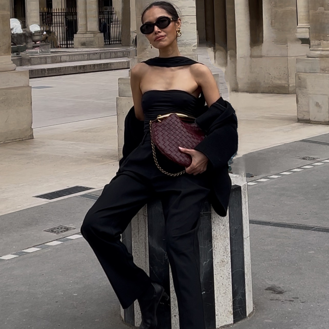
A landing page is the one asset every e-commerce brand needs and almost nobody has a good version of. The quote comes back at a few thousand, the timeline comes back at six weeks, and there are three rounds of revisions where you describe the same feeling four different ways to someone who has never sold your product.
So most stores run a template everyone else is running, and the page reads like the store next door.
This is that page, built in an afternoon, in your own words and your own photographs. You are not going to learn a page builder. You paste three prompts into Claude, describe the page you want, and point at a design you like. Claude writes the file. You open it in your browser.
The finished pageVideo banner, editorial photography, one section changing as you scroll. Built from prompts, not from a template.
The whole thing on one page
| Step | What you do | How long |
|---|---|---|
| 1 | Answer three questions about what the page is for | 10 min |
| 2 | Find one page whose design you want. Copy the link | 5 min |
| 3 | Paste prompt 1. Claude builds the whole page | 10 min |
| 4 | Fix it one section at a time, in plain sentences | 20 min |
What you need before you start
- Claude. That is the whole software stack. You will not open a page builder, a template shop or a code editor.
- Six to ten of your own photographs. Product shots, phone shots, anything real. This is the input that decides whether the finished page looks like a brand or like a template, and it is the one thing worth gathering properly before you begin.
- Your words, wherever they already live. Your current page, your About text, an email you wrote about the product. You are not writing new copy for this. You are handing over the copy you have.
- One page whose design you like. Any page on the internet. You are borrowing its layout, not its business.
Step 1. Answer three questions before you open Claude
A landing page does one job. The pages that fail are the ones that were never told what the job was.
Write down three answers. A sentence each is enough.
- Who is this page for? One specific person, described the way you would describe them to a friend. Not "customers."
- What is the one thing you want them to do? One. Book a call, buy the bundle, join the list. A page with three goals converts on none of them.
- Why should they believe you? Whatever is actually true. Years in the trade, brands you have worked with, how many you have shipped. If you have nothing yet, say so and skip it. An empty proof section is better than a fabricated one.
Step 2. Find the page you want yours to feel like
This is the step that decides whether the result looks designed or looks generated, and it takes five minutes.
Go find one page whose design you would pay for. A brand you admire, a template demo, a competitor doing it better than you. Copy the URL. You are not copying their business or their words, you are handing Claude a hundred design decisions that would take you an hour to describe badly: how much white space, how big the headline sits against the body text, how the photographs are cropped, where the eye lands first.
A link does this. Adjectives do not. "Clean and modern" describes half the internet.
Step 3. Ask for the page
One prompt. The whole page in one go, not section by section, because Claude makes better decisions about the fifth section when it already knows what the first four are doing.
Those two rules are worth reading twice. Do not invent statistics, client names, testimonials or awards is what stops you shipping a page with three glowing quotes from customers who do not exist. Tell me what is missing turns a gap into a to-do list instead of a fabrication.
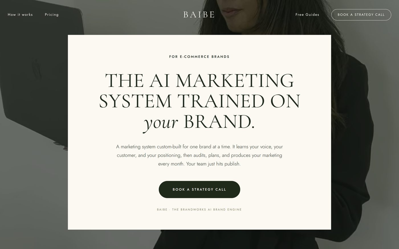
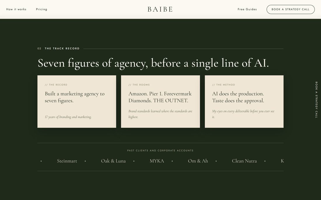
Step 4. Fix it one section at a time
The first version will be roughly eighty percent right and one section will be wrong. That is normal and it is not a problem, as long as you change one thing per message.
The reason is simple. Ask for four changes at once and you cannot tell which instruction caused the thing you did not want. Ask for one, look, ask for the next. It feels slower and it is much faster.
Real sentences that work, with nothing technical in any of them:
- "Make each of the six boxes green with cream text."
- "Put this section on a green background so the cards stand out."
- "Add the words Past Clients above the names, and make them scroll across."
- "My photo looks stretched. It should be square."
- "Tilt the three photographs slightly so they look like polaroids."
- "Delete the image at the bottom of that section."
- "Use this video as the background of the banner."
Notice what none of those mention: file sizes, image formats, screen widths, code. If you are ever being asked to supply one of those, hand the question back. Just make it work, whatever it takes is a complete instruction.
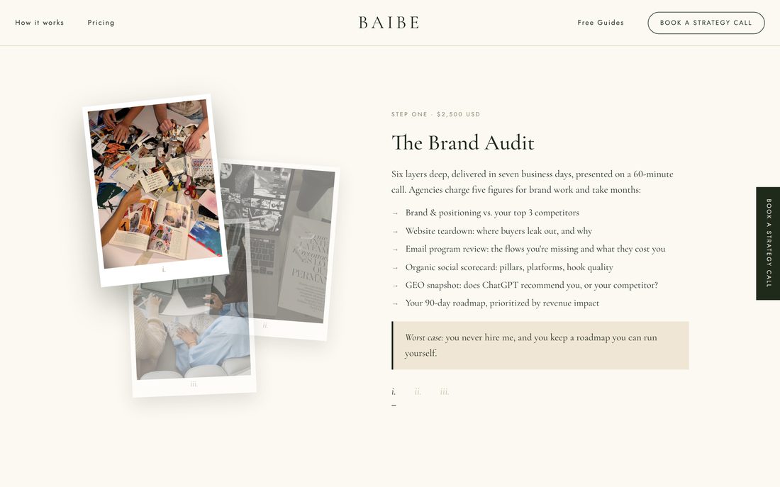
One sentence, one section"Tilt the images a bit to make them more stylized" produced this.
Ask it to check the page before anyone else sees it Optional
This is the step almost everyone skips and it takes two minutes. You are asking Claude to look for the things you will not notice until a customer does.
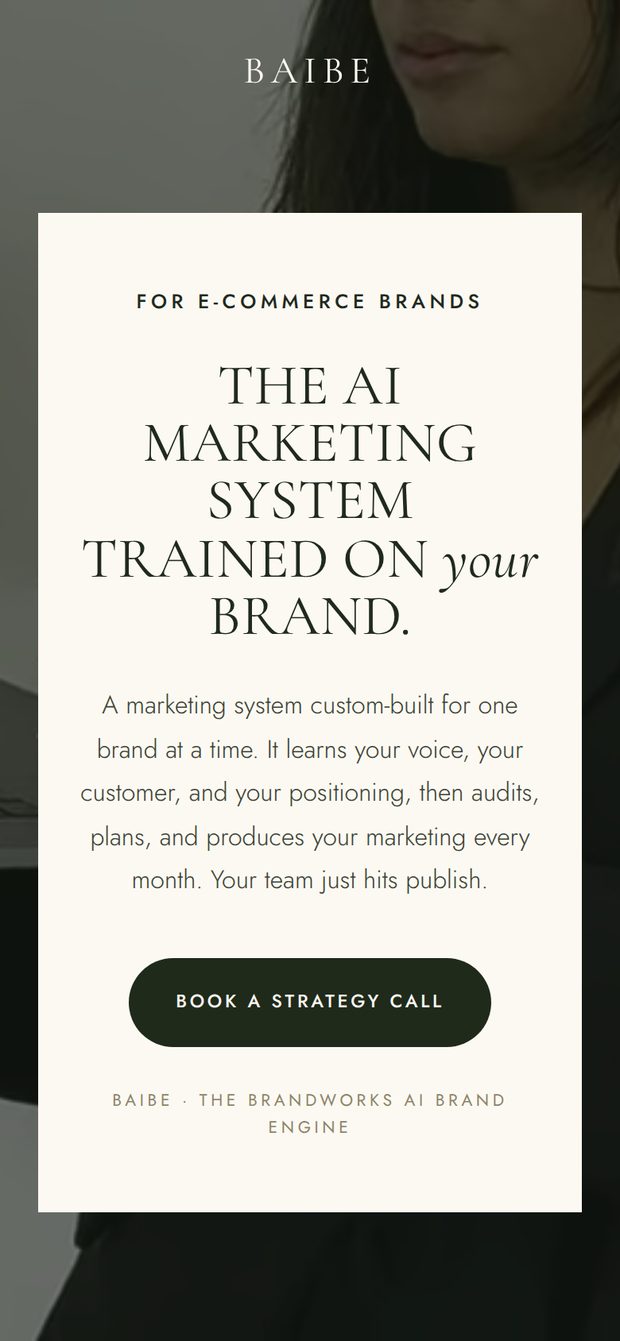
The phone checkMost people never look. It is where pages break.
The prompt chain, in order
| Prompt | What it does | What you get back |
|---|---|---|
| 1 | Builds the whole page from your brief, your words, your photos and one design link | A file you open, plus images of it |
| 2 | Changes one named section and freezes the rest | The same page, one thing different |
| 3 | Checks the page on a phone and audits it for invented copy | A list of problems and screenshots |
Things that make the difference
Point at a page, do not describe a feeling. One link carries more design direction than a paragraph of adjectives, and it is the difference between a page that looks art-directed and one that looks generated.
Give it your words and forbid it from writing new claims. The line about not inventing testimonials is the most important sentence in the whole prompt. Marketing copy that sounds impressive and is not true is the fastest way to lose a customer who checks.
One section per message, and say what must not move. "Leave every other section exactly as it is" is what stops a change to your pricing quietly rewriting your banner.
Describe the symptom, not the cause. "My photo looks stretched" is a better instruction than any guess at why. A squashed photograph is nearly always the page sizing it wrongly, not a problem with your photograph, and you do not need to know which to get it fixed.
Ask to see it before you show anyone. Asking for screenshots costs you two minutes and catches the things that would otherwise be caught by a customer on a phone.
The checklist
- Three questions answered before Claude was opened: who it is for, the one action, why they should believe you
- One design link found and pasted
- Six to ten of your own photographs attached
- Your existing words handed over, not rewritten
- "Do not invent statistics, client names, testimonials or awards" written into the prompt
- Every fix asked for one section at a time
- "Leave every other section exactly as it is" on every change
- Page checked at phone width before anyone saw it
- Every claim on the finished page something you could stand behind in a room
Can you build a landing page without a web designer?
Yes. You describe the page in plain English, paste a link to a page whose design you like, attach your own photos, and Claude builds it as one file you open in your browser. There is no template to buy, no builder to learn and no revision round to wait on. The part that stays yours is the judgment: what the page is for, what it says, and whether the result is good enough to send.
Do you need to know how to code to build a landing page with Claude?
No. You never open the code and you never edit it. Every change you ask for is a sentence a person would say out loud, like make the boxes green or the photo looks stretched. Claude reads the page, makes the change and hands the file back. If you find yourself being asked to pick a font file or a screen size, you have been handed the tool's job and you should ask for it in plain English instead.
How do you stop a landing page looking AI-generated?
Two things do most of the work. Point at a real page whose design you admire instead of describing a feeling, because a link carries a hundred decisions that adjectives do not. Then give Claude your own words and your own photographs and forbid it from writing new claims. Generic stock imagery and invented testimonials are what make a page read as machine-made, and both are things you supply rather than things the tool has to guess.
What do you do when one section of the page comes out wrong?
Change one section per message and say leave every other section exactly as it is. Naming the section and freezing everything else is what stops a fix in the pricing block quietly rewriting the header. If a photograph looks squashed or stretched, say that in those words rather than replacing the photo, because it is almost always the page sizing it wrongly and not the image itself.
Where do the photos on the page come from?
Yours. Attach six to ten photographs you already own, including imperfect phone shots, and Claude places them, crops them and sizes them for you. Photography is the single biggest signal of whether a page looks like a brand or like a template, so this is the one input worth gathering before you start rather than settling for whatever is easiest to find.