Your store needs the same product in three different shapes. A wide hero at the top of the site. A short banner in the email. A vertical frame for paid. Three placements, three focal points, three sets of empty space for copy to sit in.
Most brands brief a shoot for none of that. They come back with a hundred images in one crop, use six, and then a designer spends a week retrofitting the rest. The shoot cost real money and the placements still are not right.
You do not need the shoot. You need one photo of the product, taken on your phone, and three prompts. Here is the photo I used and everything that came out of it.
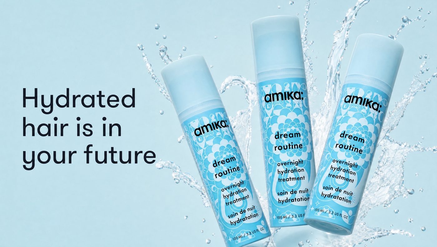
The website heroBuilt from the phone photo further down this page. Nothing else went in.
What does one phone photo actually turn into?
Three finished placements, each with its copy already set into the image. This is the whole output of the guide, made from a single photo and nothing else.
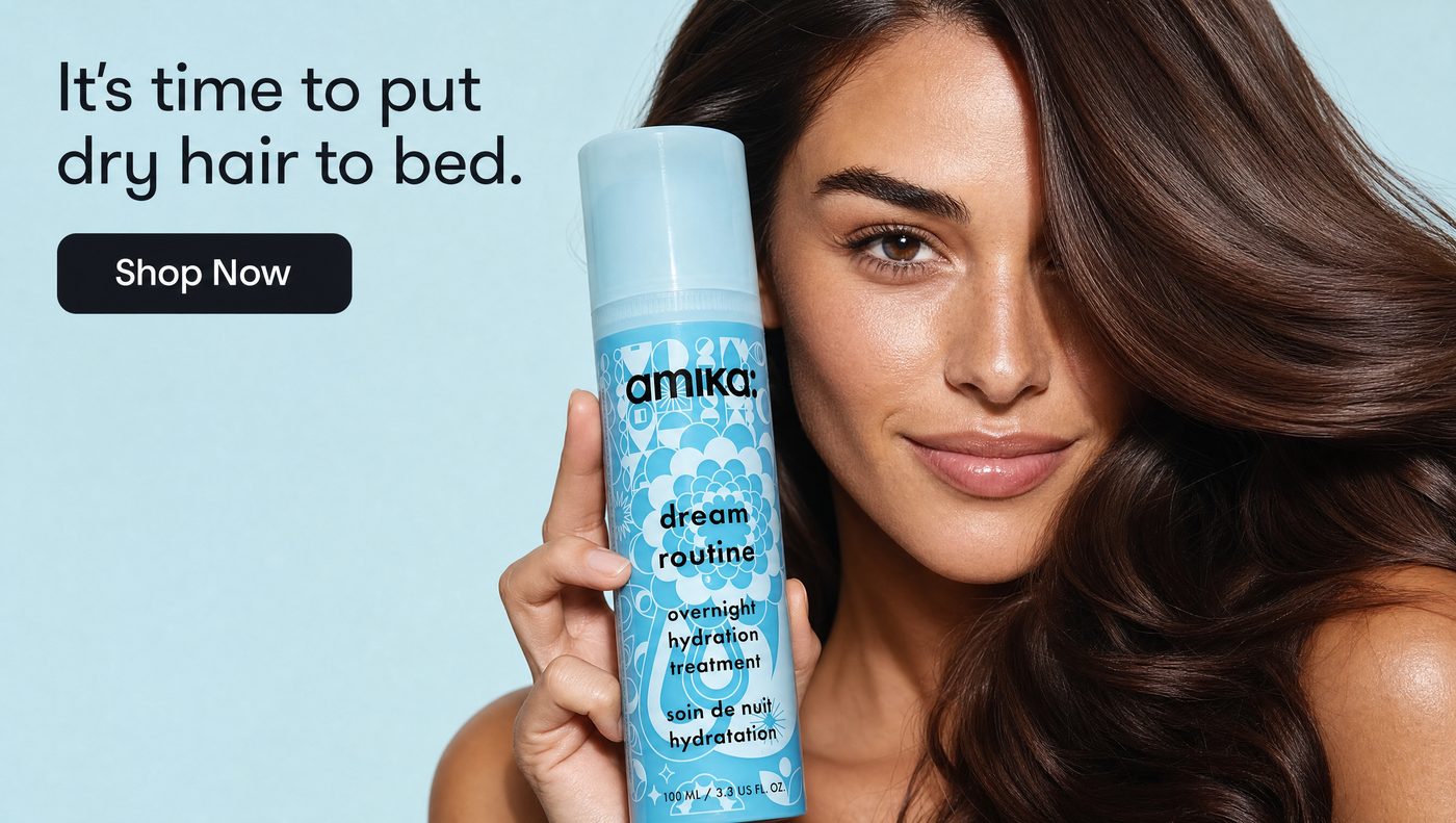
The email bannerModel, headline and button, all generated in one pass.
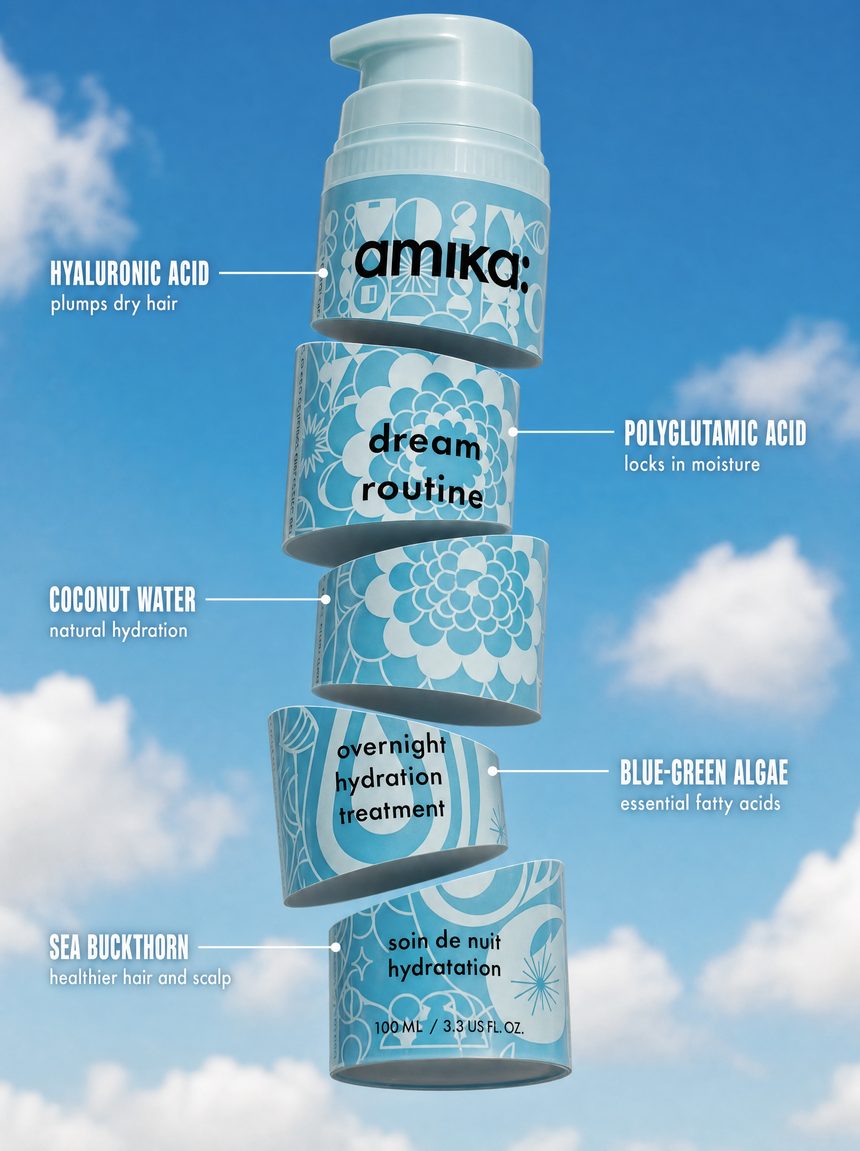
The paid adThe product cut into five slices, each one labeled.
How good does the phone photo have to be?
Good enough to read the label. That is the whole bar. Mine was the bottle lying on a bedsheet by a window, shot from directly above, and every placement on this page came out of it.
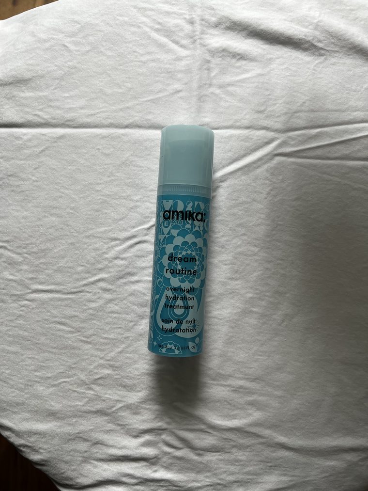
The inputShot on a phone, on a bedsheet, in about a minute.
Three things matter and nothing else does. Shoot it upright rather than lying sideways, so it goes in the same way up as it comes out. Fill the frame with the product. And get light from a window rather than a ceiling light, because overhead light flattens the label and the label is the one thing that has to survive.
The whole thing on one page
| Step | What you do | How long |
|---|---|---|
| 1 | Photograph your product once, on your phone | 5 min |
| 2 | Find one image whose styling you want to copy | 5 min |
| 3 | Paste the prompt for the placement you need | 5 min each |
| 4 | Look at it on your phone, ask for one change | 5 min |
What you need before you start
- One photo of your product, taken on your phone, label facing the camera.
- Your headline for each placement, already written. Do not let AI write it.
- One reference image whose styling you want, saved to your desktop.
Why do AI product images come back with the label redrawn?
Because nothing in the request told it not to. Left alone, an image model treats your packaging as a suggestion and rebuilds it in a style it likes better. Your brand name comes back slightly wrong, and it is the kind of wrong that nobody can name but everybody notices.
This paragraph fixes it. It sits at the bottom of all three prompts below, unchanged, every time.
How do you get a website hero out of it?
Ask for the product on one side and empty space on the other, and say what the empty space is for. A hero with the product centered is a hero your headline has nowhere to live.
How do you get an email banner with a model in it?
Describe the crop and describe what the hero of the shot is. If you do not say which part of the picture matters, you get a person holding a bottle, which is not the same thing as a beauty banner.
How do you turn one product into an ingredient ad?
Cut it into slices and label them. This is the highest-performing static ad format in beauty and supplements, and it is the one people assume needs a 3D artist.
How do you get it to match a look you have already found? Optional
Show it the reference instead of describing the reference. Attach the image alongside your product photo and say which part of it you want. These are the two I used, and you can see exactly which decision each one drove.
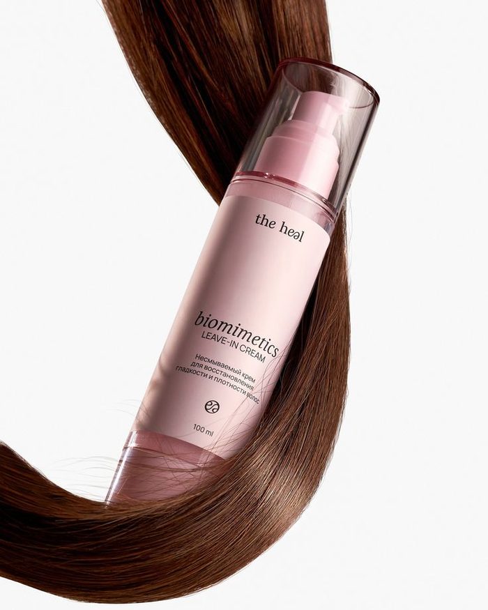
Reference oneThe hair passes behind the bottle, never across it. That is why the label stays readable.
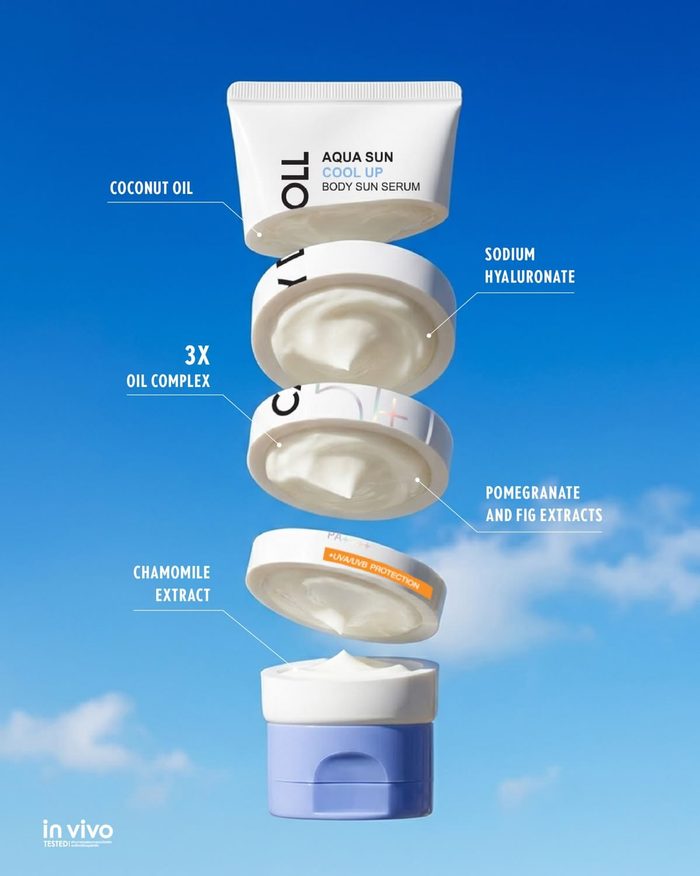
Reference twoSliced product, sky background, thin callout lines. Prompt 3 is this structure.
The prompt chain, in order
| # | Prompt | What comes back |
|---|---|---|
| 1 | The website hero | Wide banner, product right, headline left |
| 2 | The email banner | Model, headline and button in one image |
| 3 | The paid ad | Vertical ad with five labeled slices |
| + | The styling reference | Any of the above, matched to a look you found |
Things that make the difference
Give it the product, not a description of the product. A photo carries your label. A sentence about your label produces a new one.
Say what the empty space is for. "Leave the left third empty for my headline" is the line that makes an image usable as a placement rather than a pretty picture.
Name the background against the product. A pale product on a pale background disappears. Asking for the background to be clearly different in tone, with shadow and edge contrast, is what keeps it visible at thumbnail size.
Keep every callout to four words or fewer. Ingredient name plus a short benefit holds. Full sentences at that size come back misspelled.
Tilt everything by a different amount. Three products at the same angle read as a template. Three at different angles read as a shoot.
The checklist
- Product photographed upright, label facing camera, window light
- Headline written before you open the tool
- Product lock paragraph pasted at the end of the prompt
- Empty space named and assigned to the copy
- Background tone named against the product tone
- Every word of every callout read back at full size
- Checked on a phone, not just on the desktop
Can you really build a website hero, an email banner and an ad from one phone photo?
Yes, and the photo does not have to be good. It has to be legible. Shoot the product upright with the label facing the camera, fill the frame, and use window light rather than a ceiling light. Every placement on this page came from one shot of a bottle lying on a bedsheet. What makes the difference is not the quality of the photo, it is whether the request names the shape, the empty space and the copy for each placement separately.
How do you stop AI from redrawing your product label?
Tell it not to, in the same message, every time. Say to reproduce the product exactly as it appears in your photo, that the label artwork, the typography, the colors and the proportions do not change, and that nothing is allowed to cover the brand name or the product name. Without those sentences an image model treats your packaging as a style suggestion and rebuilds it. With them, the label survives even when a hand is holding the product at close range.
Why does the product disappear into the background?
Because the background was named on its own rather than against the product. If your packaging is pale blue and you ask for a pale blue background, you get two pale blues and no separation. Ask for the background to be clearly different in tone from the product, and ask for shadow and edge contrast to hold the edge. Then check it at thumbnail size on a phone, because a banner that reads on a desktop can still dissolve in an email preview.
Why does text in AI images come back misspelled?
Density. Image models hold short text well and long text badly, and the failure rate climbs with every word. Keep each callout to an ingredient or feature name plus three or four words of benefit, and it holds. Ask for full sentences across five separate labels and you will be re-running it. Read every word back at full resolution before anything is published, because a typo in a product claim is worse than no ad at all.
How do you match a look you found somewhere else?
Attach the reference image next to your product photo and name the one thing you want from it. Say to use it only for its background color, or only for its lighting, and to ignore its subject, layout and text. Left unnamed, the model copies the whole picture, including the other brand's product. The most useful references are structural rather than pretty: how a strand of hair passes behind a bottle instead of across it is worth more than a mood.