You already have the photo. It is on your phone, it was taken on a counter next to a window, and you have been treating it as a placeholder until you can afford a shoot.
It is not a placeholder. It is the reference.
This is the file behind that video. I ran a full set for a six product beauty lineup from two phone photos: catalog, lifestyle, campaign portrait, Pinterest pin and two website banners. Every prompt is below, written so you can paste it in and swap what belongs to your brand.
What do you need before you start?
Less than you think, and none of it is a camera.
- Two photos of your product. One overhead flat lay on a plain textured surface in natural window light. One wider frame of the same items rearranged. That is the entire shoot.
- Claude, with the Higgsfield connector switched on. You write briefs instead of clicking through an interface, and the image model runs underneath.
- Your lineup written down. Product name, form factor, finish, cap color, logo placement. Built once, pasted into every prompt.
- Your brand rules written down. Palette, textures, mood, and a list of what is banned.
Upload the two photos once. The tool hands back permanent media IDs, and you attach those same IDs to every generation for the rest of the session. That single habit is what keeps the packaging identical across a whole set rather than drifting a little more with each image.
Step 1. Write your lineup down
This is the block that stops the model inventing packaging. A reference photo on its own is a suggestion. The model only treats it as fact once the words agree with it.
Fill this in for your own products. One row each, and be specific about the boring part: the cap, the finish, the shape.
| # | Product name | Form | Finish and cap |
|---|---|---|---|
| 1 | Your product name | Tube, jar, compact, bottle, pouch | Matte or gloss, the color, the cap |
| 2 | Repeat for every item you want in frame, in the order you want them to appear. | ||
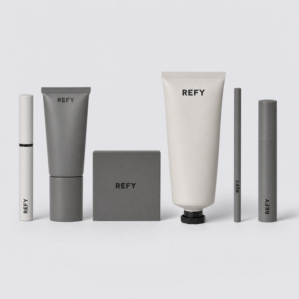
Here is the version I ran, so you can see the level of detail that works. The products belong to a beauty brand I do not own, used here as a worked example rather than a client project.
| # | Product | Form | Finish |
|---|---|---|---|
| 1 | Brow gel | Slim tube, black band | White matte |
| 2 | Face primer | Tube, wide roller cap | Matte grey |
| 3 | Cream bronzer | Soft-square compact | Matte grey |
| 4 | Body glow | Large tube, black flip-top cap | Off-white matte |
| 5 | Brow pencil | Slim barrel | Matte grey |
| 6 | Mascara | Cylinder | Matte grey |
Step 2. Write your brand rules down, including what is banned
Lock these at the start and repeat them, in some form, inside every single prompt. Four lines in, one line out.
The banned list is not optional garnish, and it is the line most people skip. Image models add warm metallic accents and invented lettering without being asked, because those features are everywhere in what they learned from. Naming them as exclusions is the only thing that keeps them out. Leaving the list off is not neutral. It is a vote for the default.
In the set below, banned meant brass, gold, olive, warm wood and colored props. Yours will be different, and writing yours down is a five-minute job you do once.
The setup message
Send this first, with both photos attached, and do not let it generate anything yet. Confirming the references landed costs one message. Discovering they did not costs a whole set.
The skeleton every prompt below follows
Six formats, one structure. Once you can see it, you can write the seventh one yourself.
- Format and shot type. Not "a nice photo of my product." Say catalog lineup, lifestyle scene, moodboard pin, wide cinematic banner.
- The products, enumerated. Your lineup block, in the order they should appear.
- Logo fidelity. The wordmark, the typeface style, and the phrase "legible, correctly placed and true to the reference photographs."
- Composition. Where things sit, how they are angled, what is hero, what is empty.
- Light. Direction, quality, and where the shadow falls.
- Palette, mood, and the banned list. Always last, always explicit.
Prompt 3. The e-commerce catalog lineup
This is the product detail page shot and the marketplace listing shot. Square, evenly spaced, nothing clever.
Why it works: the left to right enumeration. Numbering the products in reading order gives the model a layout instruction, not just a shopping list. Without the numbers you get the right products in the wrong order, and you will regenerate three times before you work out why.
Prompt 4. The lifestyle scene
Same products, opposite job. This one has to look like nobody arranged it.
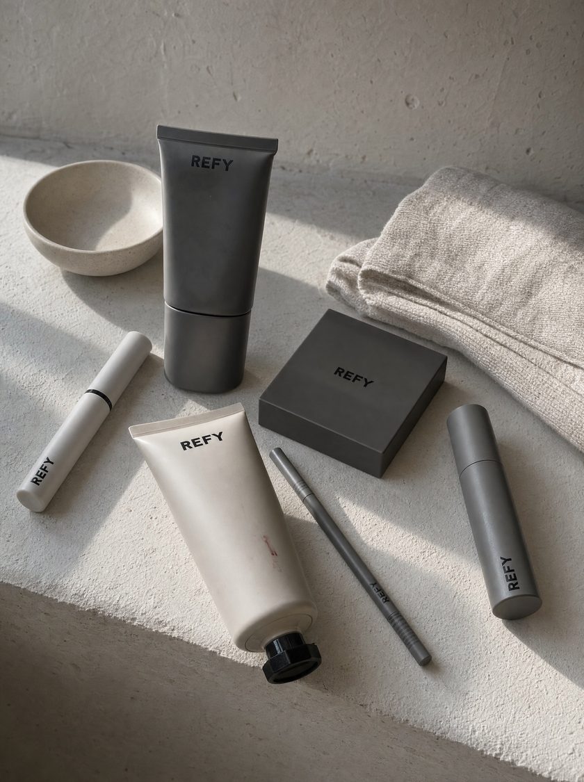
Why it works: "arranged naturally rather than perfectly aligned" and "as if left there after use" are the two clauses doing all the work. Take them out and you get another tidy row on a different background, which is a catalog shot wearing a costume.
Prompt 5. One product, one person
The lineup sells the range. A single product against skin sells the product. Pick your hero item and drop the other five.
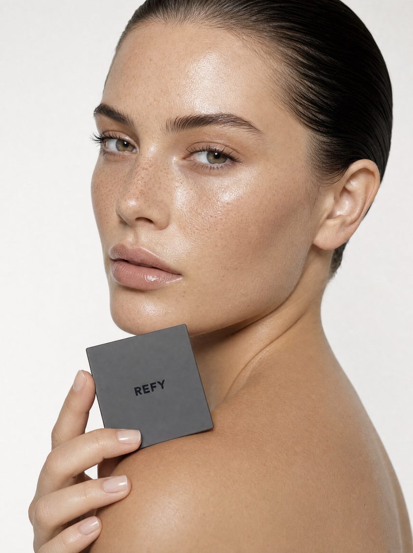
Why it works: "skin glow and texture retained" is doing real work. These models default to plastic, over-retouched skin, and poreless skin is the fastest way for a viewer to clock an image as generated. Asking for the texture back is what makes it read as a photograph.
Prompt 6. The Pinterest pin
The highest risk prompt in the set, and the one worth the risk, because a pin is the only one of these formats that keeps working six months after you post it.
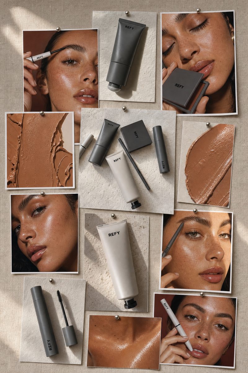
Why it works: describing the pin as a real physical thing, a board with push pins, paper edges and curl, is what stops it rendering as a flat digital grid.
Prompt 7. The website hero banner
Two ways to do this. The first is a recrop of a shot you already approved, and it is the one that keeps a campaign coherent.
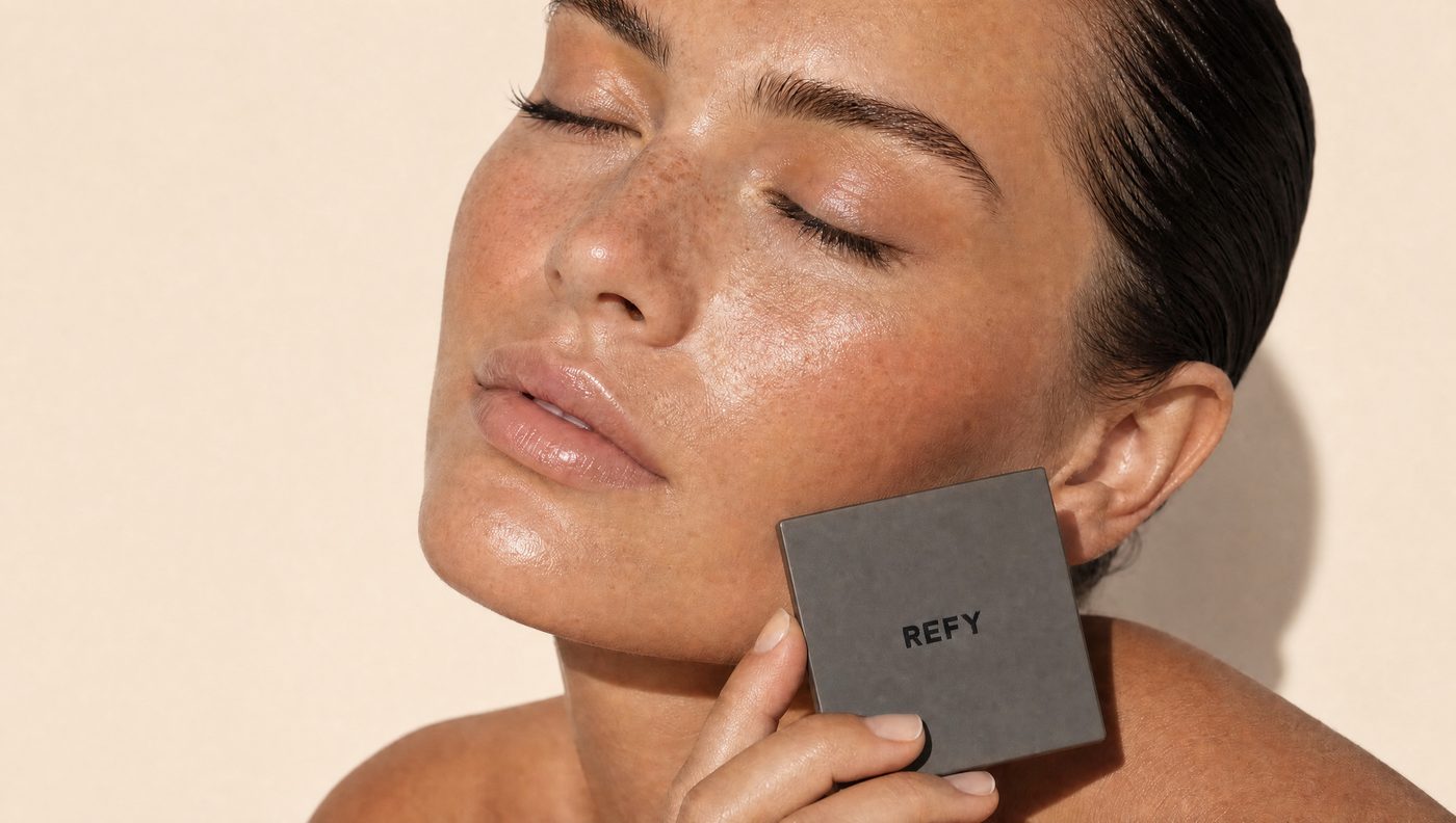
The second way is the opposite instinct. One product, scaled up until it is absurd, and a real scene behind it.
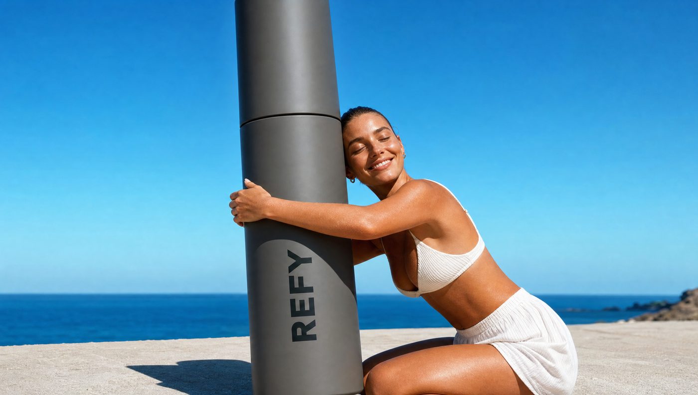
Why it works: that one phrase tells the model this is a physical scaled object standing in the scene, casting a real shadow, rather than a graphic composited on top of a photo. Leave it out and you get a sticker.
How do you fix one thing without losing the image?
You will get a frame you love with one flaw in it. Do not rewrite the original prompt and regenerate. You will lose everything that was working.
The pattern, in five moves:
- Pass the finished image in as the only reference. Not the product photos.
- Open by saying this is an edit.
- Enumerate everything that must stay the same, in detail. This is most of the prompt.
- State the single change.
- Close with "do not alter anything else."
What I learned that is not obvious
Aspect ratios are not all available, and a refusal can look like a success
The model behind this supports 1:1, 4:3, 3:4, 16:9, 9:16, 3:2 and 2:3. It does not support 4:5.
I briefed 4:5 for the lifestyle set. Nothing failed. The platform silently substituted 3:4, reported it as the closest match, and handed back files roughly seven percent taller than I asked for. I only caught it by reading the parameters in the response.
Check what came back, not just what it looks like. A silent substitution looks exactly like a success, and 4:5 is the Instagram portrait ratio, so this is the one most likely to bite you.
| Aspect ratio | Delivered at 2k | What it is for |
|---|---|---|
| 1:1 | 2048 × 2048 | Catalog, marketplace, product detail page |
| 3:4 | 1744 × 2336 | Lifestyle, portrait, feed |
| 2:3 | 1360 × 2048 | Pinterest, moodboard |
| 16:9 | 2688 × 1520 | Website hero banner |
Negative space needs an explicit instruction
If you need room for a headline, "leave space at the top" will not do it. These models fill empty areas, because empty areas are rare in the photographs they learned from.
What works is naming the zone, its purpose and its emptiness in one sentence:
The entire upper third of the image is deliberately empty plaster, clean negative space reserved for a text overlay, with nothing in it.
Three claims in one line: where it is, what it is for, and that it contains nothing. Drop any one of them and something appears there.
Content filters block compositions, not words
One of my banner ideas was rejected twice. I reworded it. I added clothing. Still rejected. Changing which body part formed the composition passed on the first attempt and kept exactly the same graphic idea.
When a generation is blocked, change the composition, not the vocabulary. Rewording the same picture is the slowest possible route.
The palette decision that changed the whole set
The first pass at the pin and the hero banner was built strictly to the brand rules. Cool grey, greige, off-white, no color anywhere. Reviewed in feed, it read flat. For a makeup brand, an all-grey frame is not restraint. It is absence.
The fix was not to abandon the brand rules. It was to split them.
- The scene carries color. Sunlit skin, warm bronzer tones, saturated blue.
- The packaging keeps its true colorway, because that is the actual product.
The contrast between a rich scene and a quiet product is what makes the product read as considered. When the whole frame is one temperature, nothing stands out and the restraint reads as a mistake.
What separates this from an amateur AI product photo?
Not the prompt. Three things, and none of them are tool skills.
- Generating per format, not per idea. One prompt per marketing job, with that job written into the prompt. "A nice photo of my product" has no brief inside it, so the model picks one, and it picks the average of everything.
- Reading the parameters, not just the picture. Model, dimensions, aspect ratio, references attached. Half the problems in a set are visible in the response before they are visible in the image.
- Checking what a machine cannot check. Correct number of products. Wordmark spelled right and on the right face. No invented items. No stray lettering in the area you reserved for type. That pass takes a minute per image and it is the only thing standing between a usable set and a set that gets noticed for the wrong reason.
Two phone photos and an afternoon gets you the images. Knowing which ones to keep is still the job.
How many photos do you need to generate AI product images?
Two is enough. One overhead flat lay on a plain textured surface in natural light, and one wider frame of the same products rearranged. Upload both once, keep the media IDs the tool returns, and attach those same IDs to every generation afterwards. That is what keeps the packaging identical across a whole set.
Why does AI keep changing my product packaging?
Because the prompt describes a category instead of an object. Name each item by product name, form factor, finish and cap color, in the order it should appear, and repeat that block in every prompt. A reference photo alone is not enough. The model treats it as a suggestion until the words agree with it.
Why does AI add gold and lettering I never asked for?
Image models add warm metallic accents and invented text unprompted, because those features are common in the imagery they learned from. The fix is an explicit banned list at the end of every prompt naming the specific finishes, props and lettering that must not appear. Omitting the list is not neutral, it is a vote for the default.
What aspect ratios does GPT Image 2 support?
1:1, 4:3, 3:4, 16:9, 9:16, 3:2 and 2:3. It does not support 4:5. Requesting 4:5 does not fail, it is silently substituted with the closest supported ratio, so always read the parameters the tool returns rather than judging by the image alone.
How do you keep a set of AI product images looking like one shoot?
Pass a finished generation back in as a reference for the next one. A wide banner briefed from scratch produces a different model and a different room. The same banner briefed with the approved portrait attached reads as a recrop of the shot you already have.